The Love Inn
Identity design for an energetic bar and restaurant
— once an old bank — with live music, located
in Bristol's vibrant Stokes Croft.
— once an old bank — with live music, located
in Bristol's vibrant Stokes Croft.
Logotype
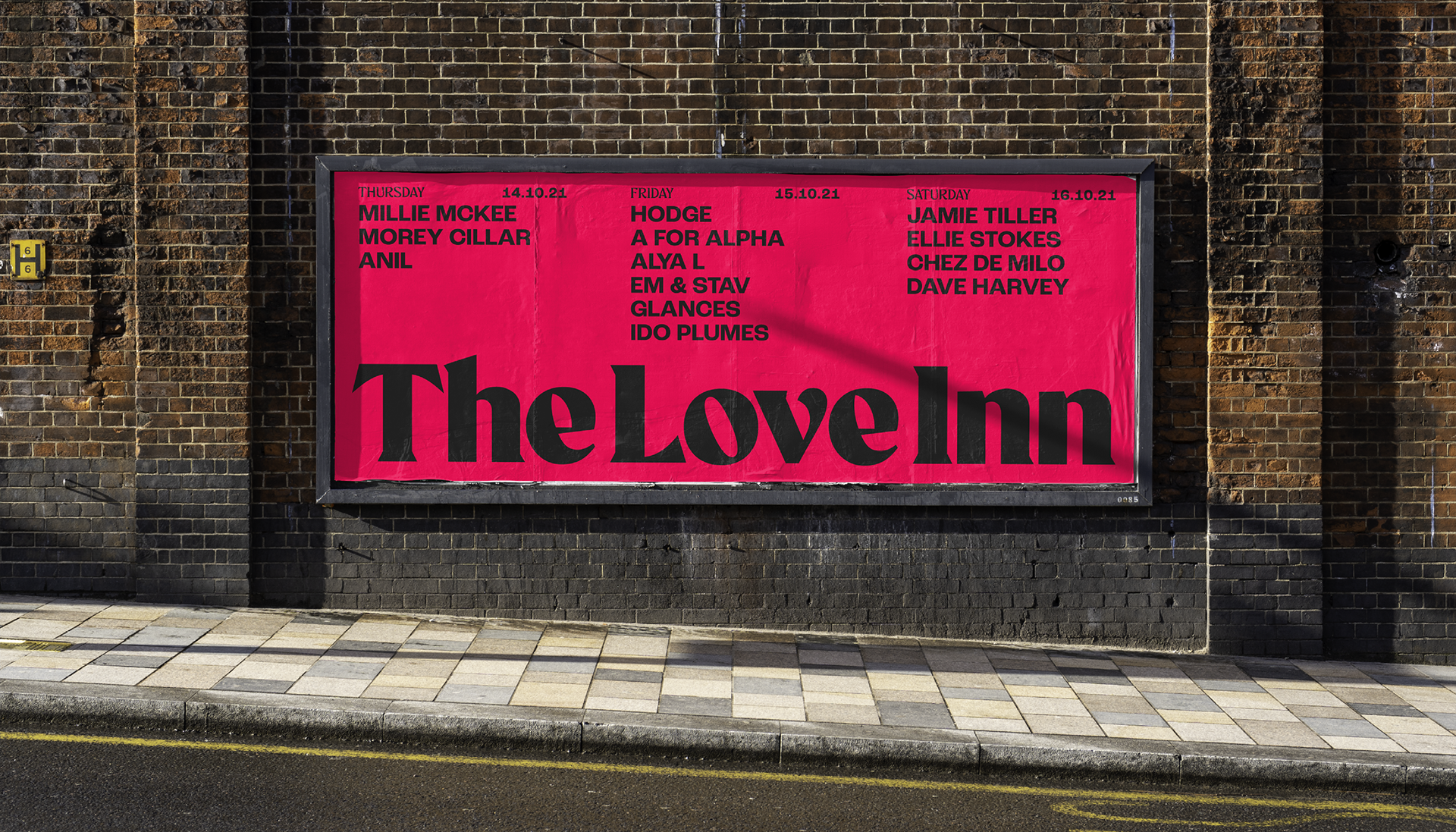
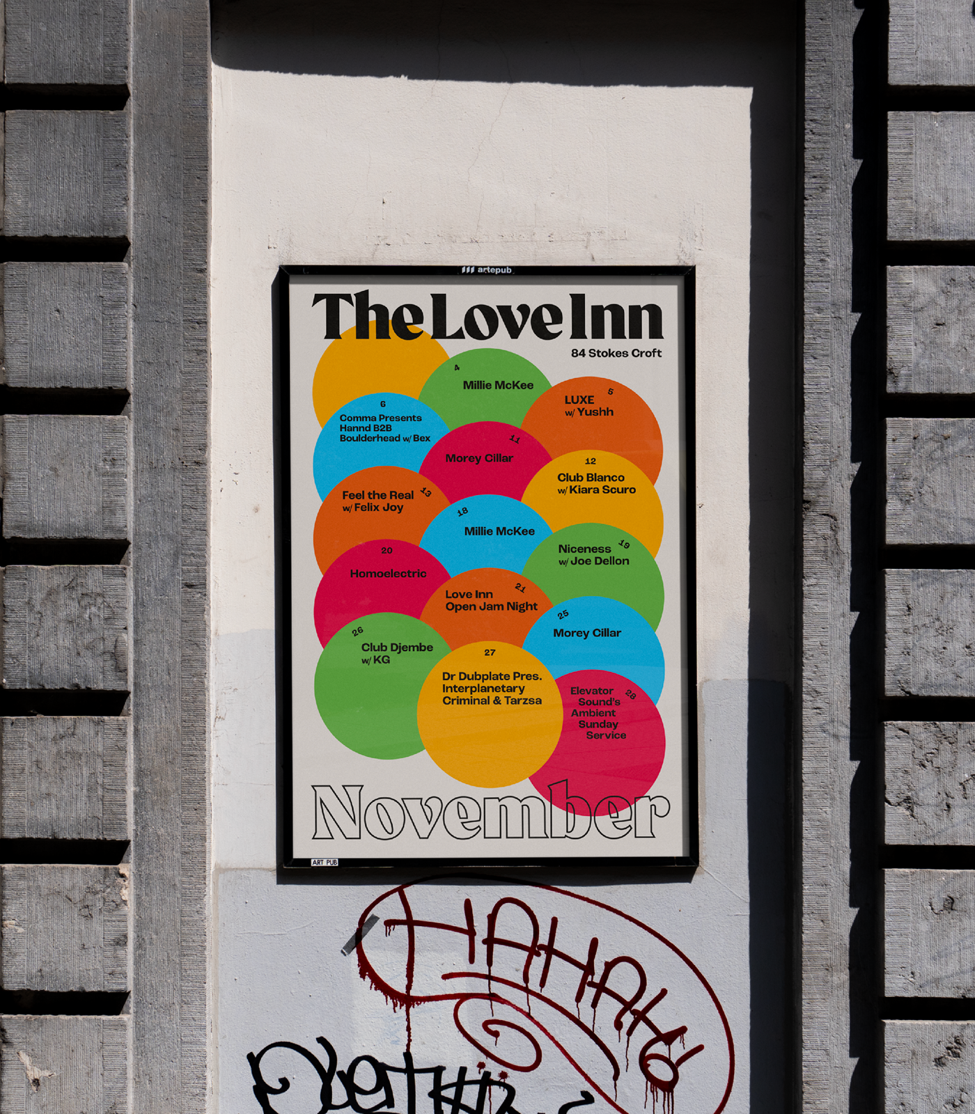
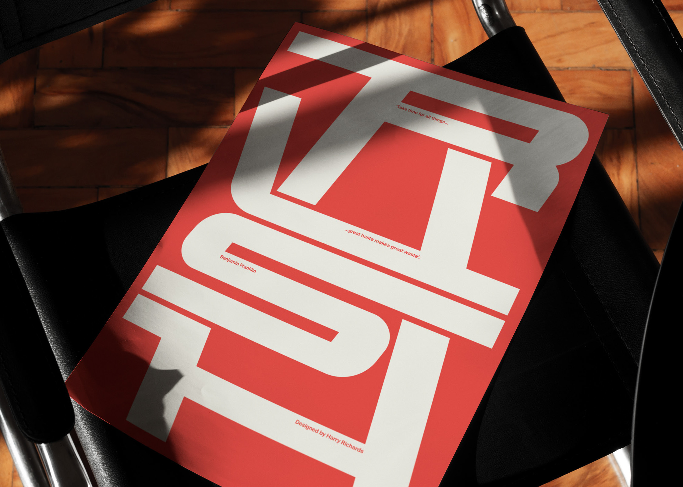
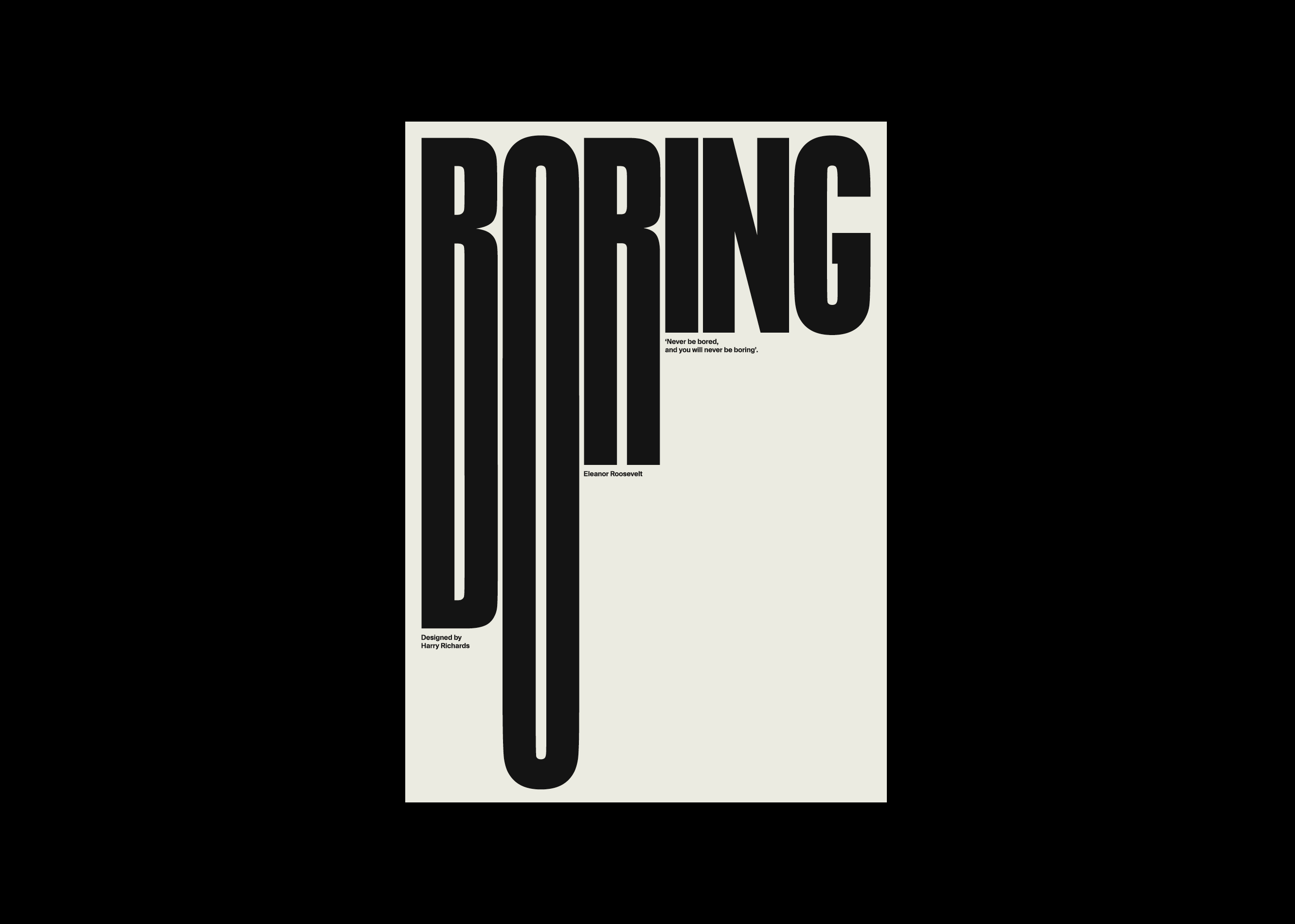
Posters
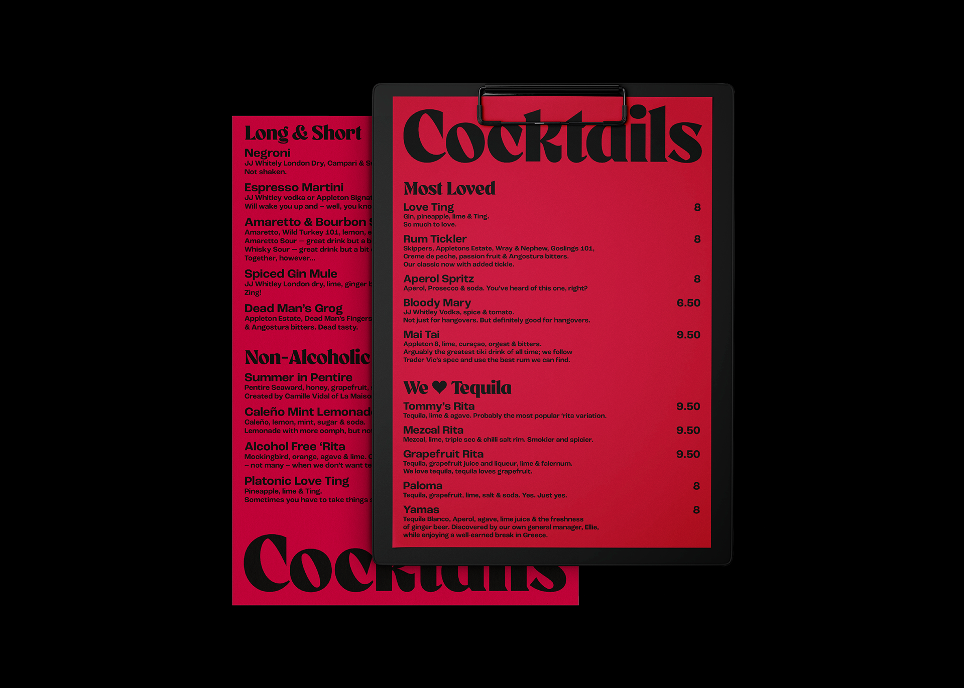
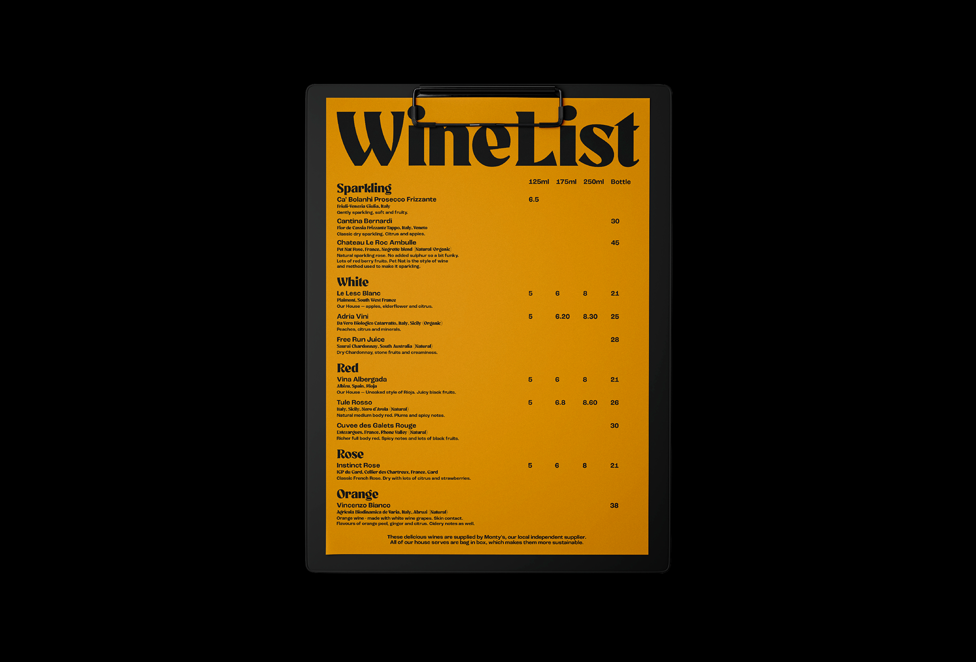
Menus
Tap Lenses
Membership Cards
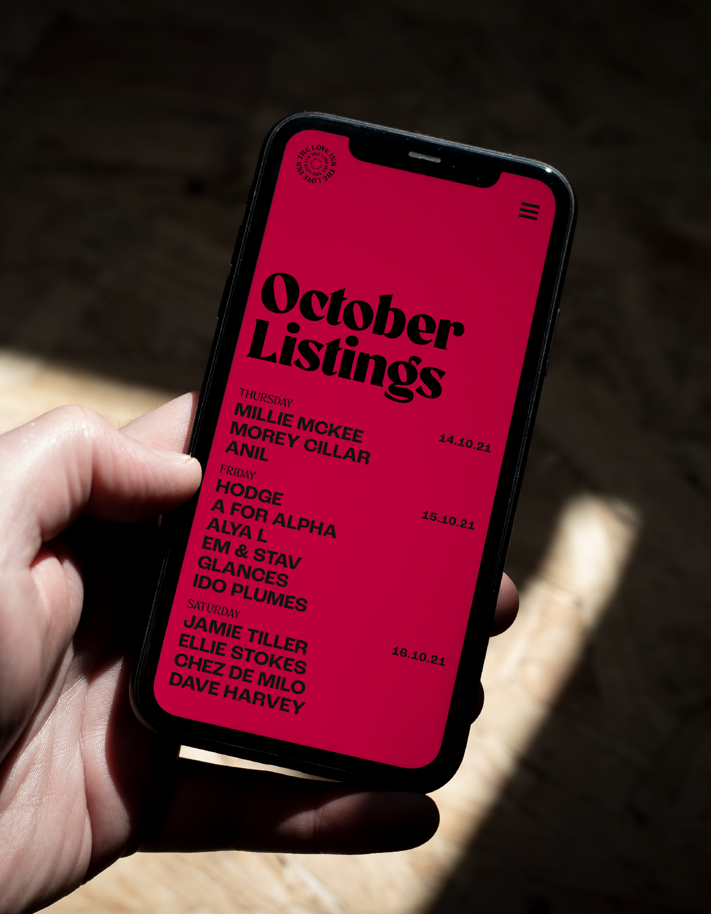
Listing Assets
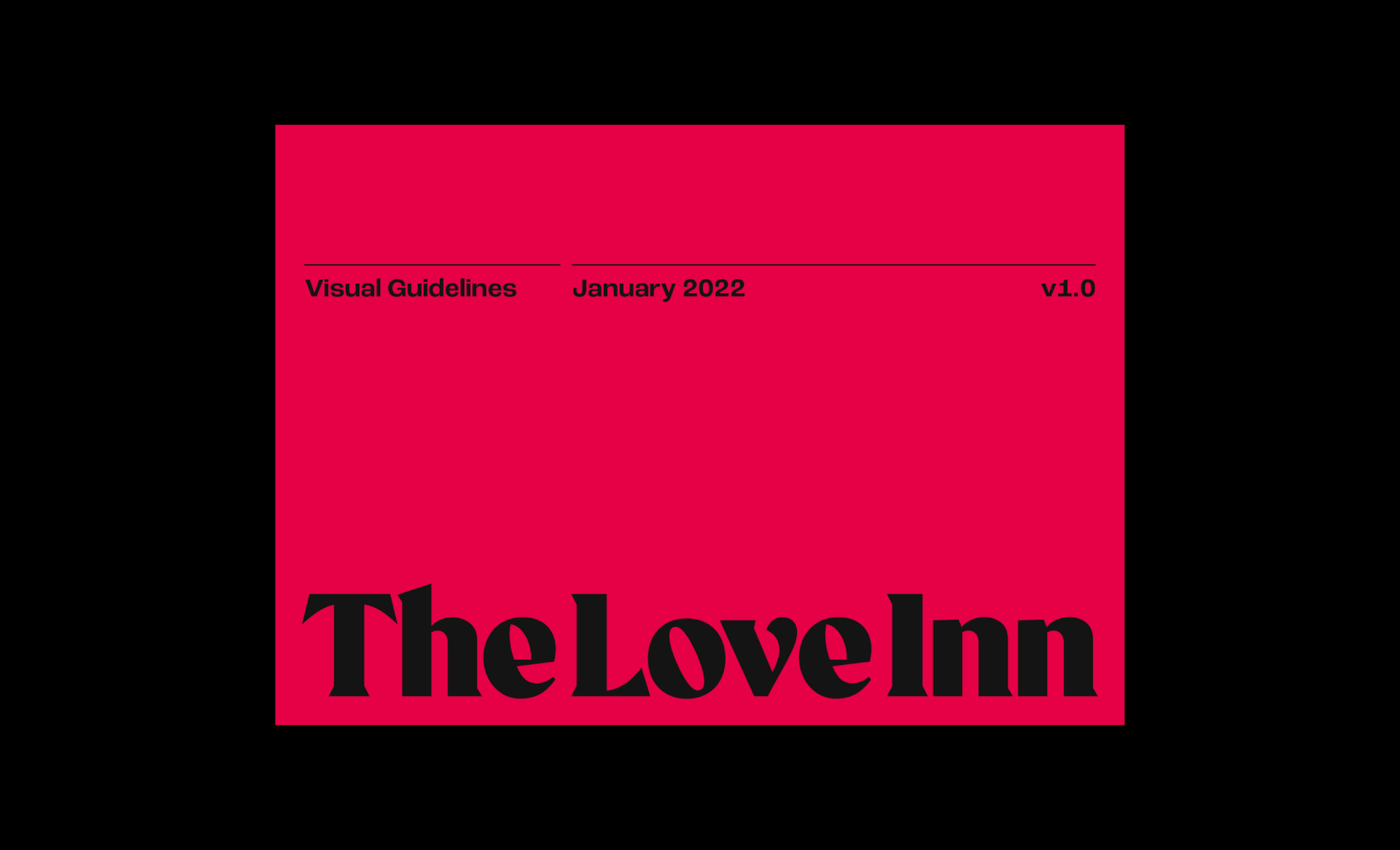
Identity Guideline
Digital Assets
Posters
Menus
Tap Lenses
Membership Cards
Listing Assets
Identity Guideline
Digital Assets
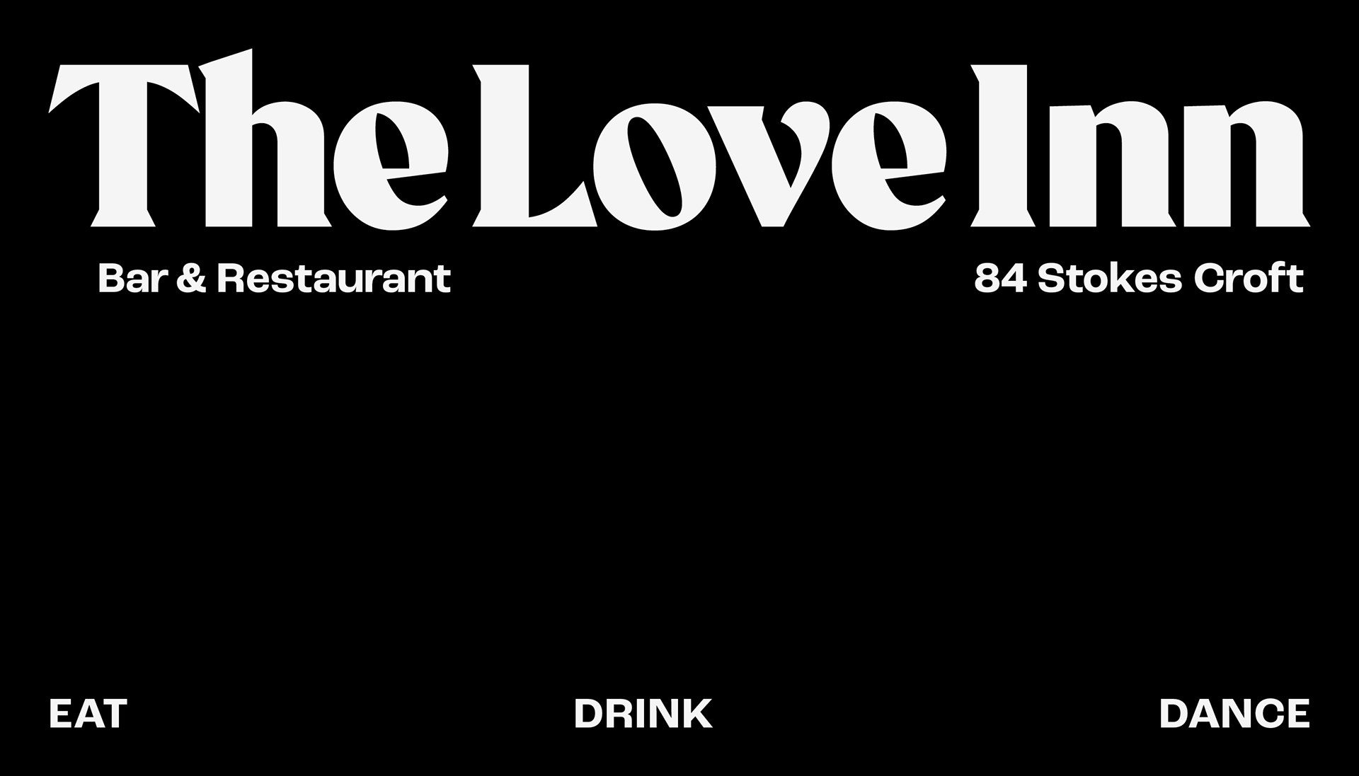
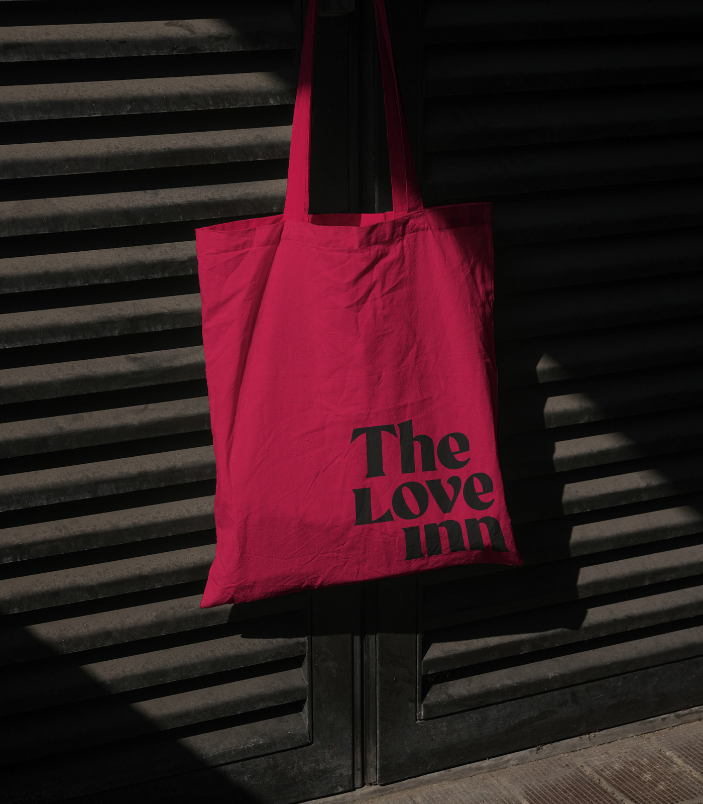
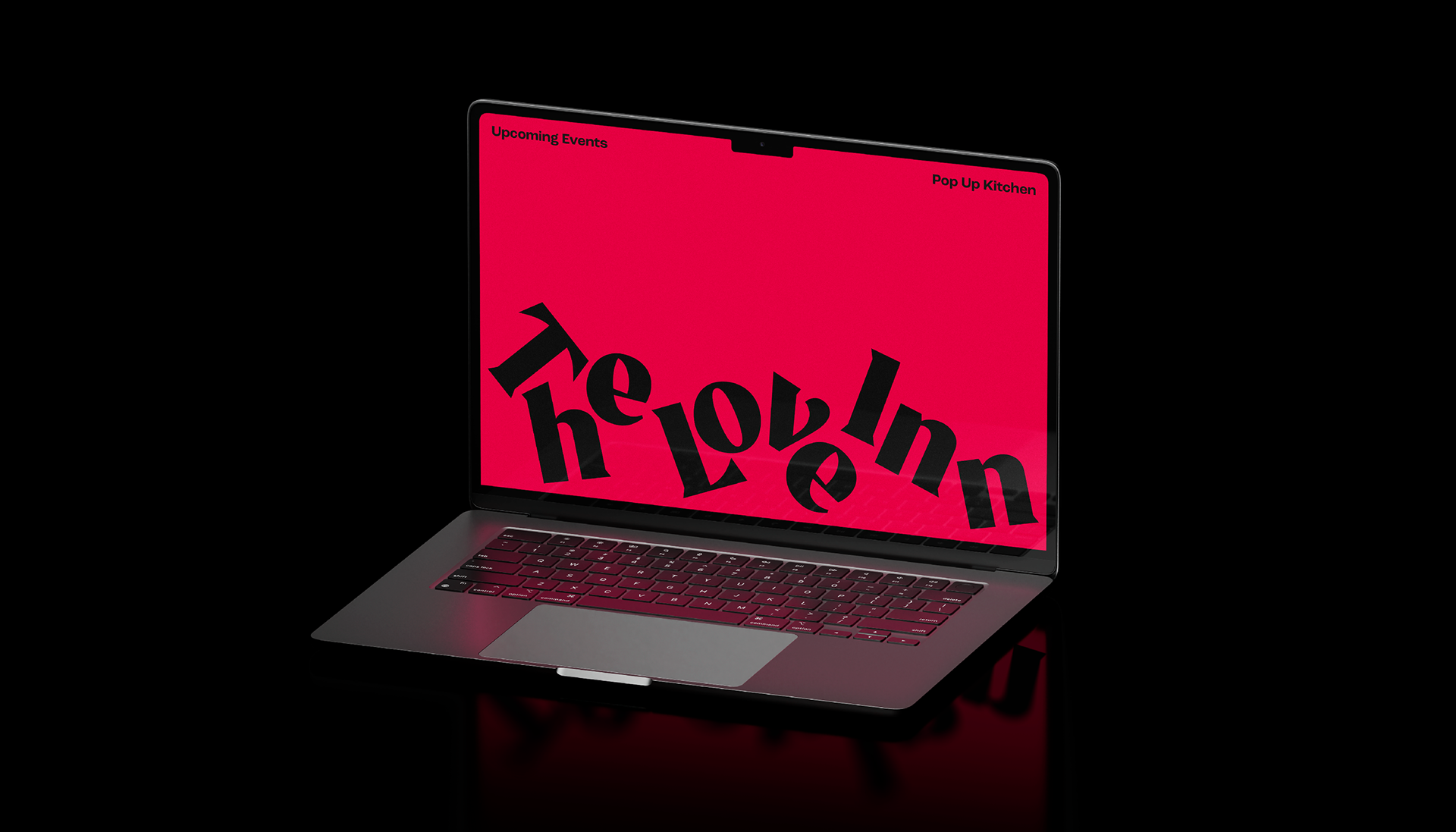
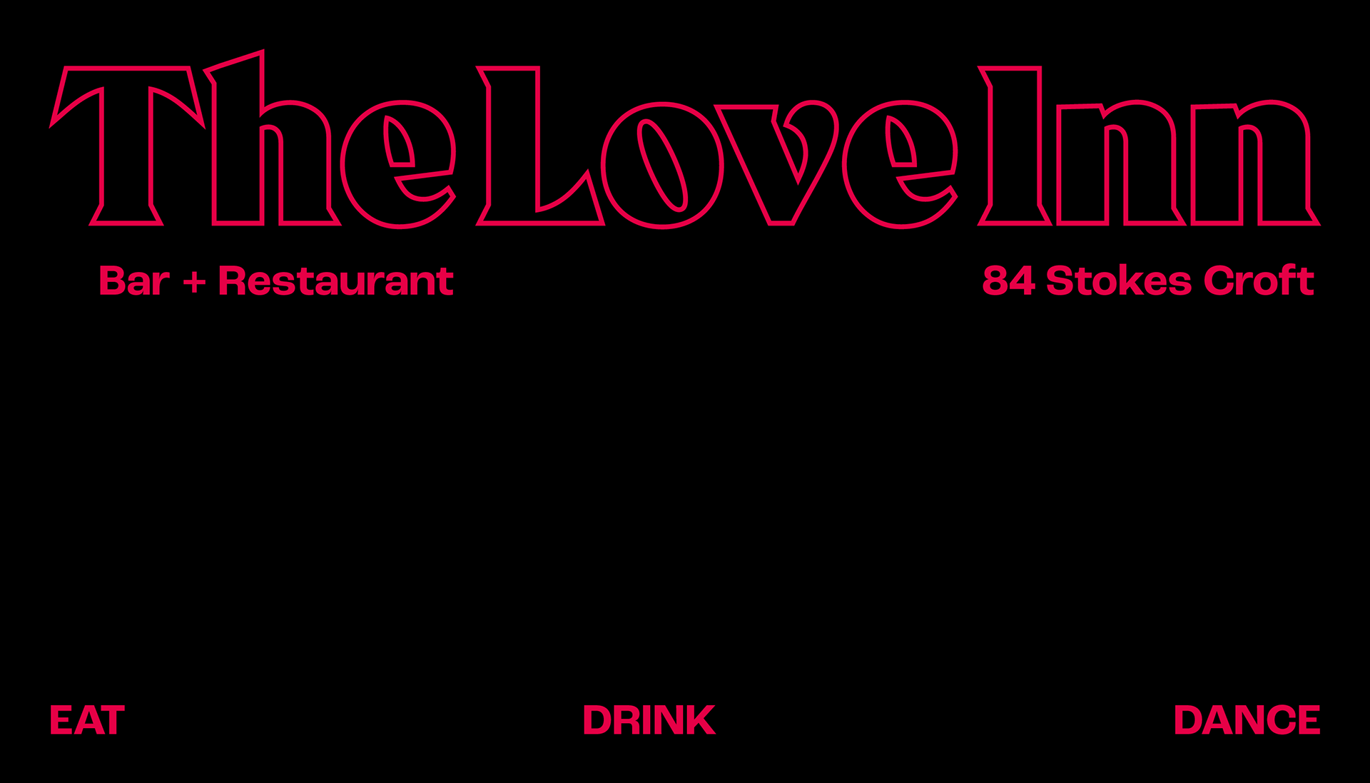
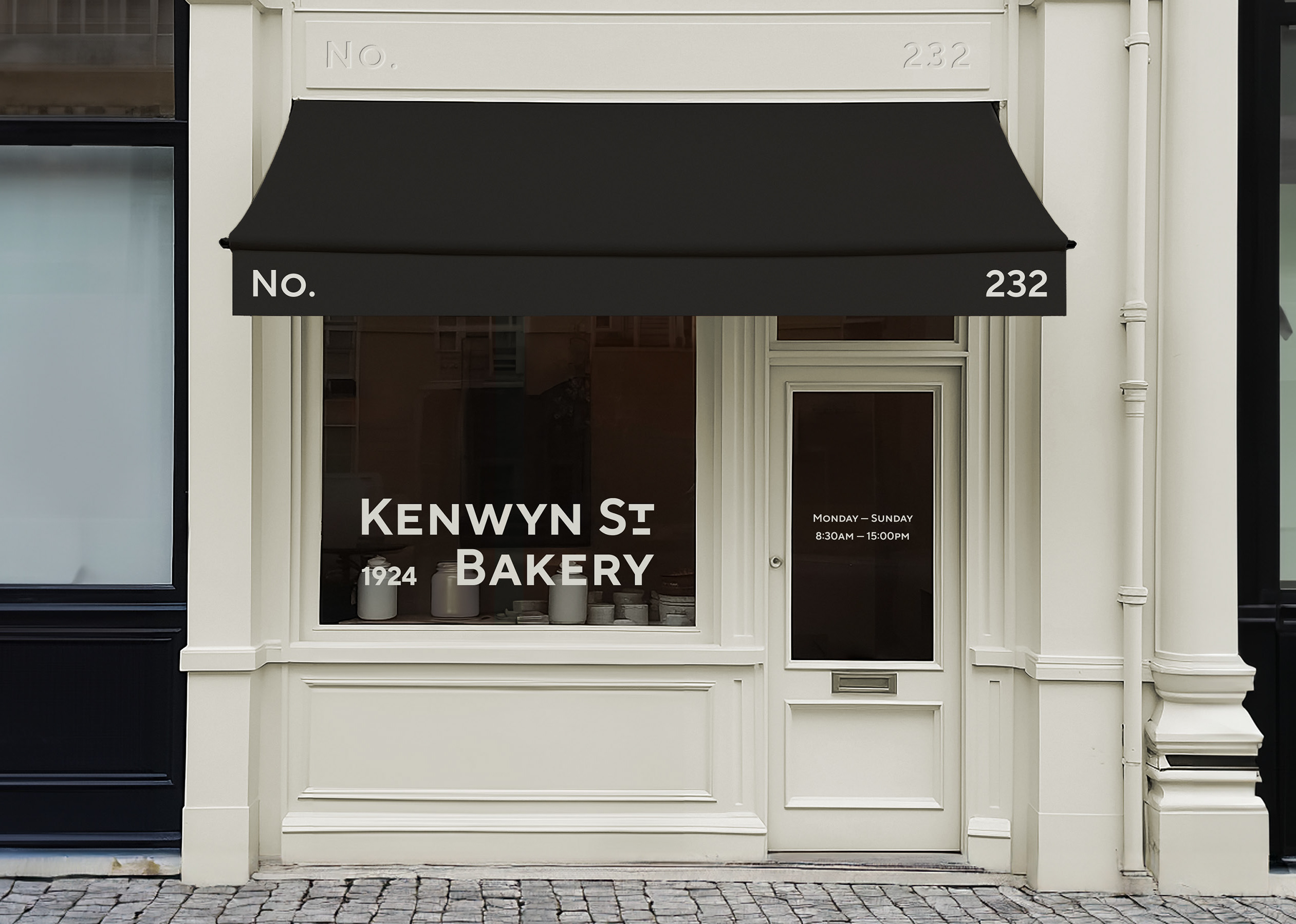
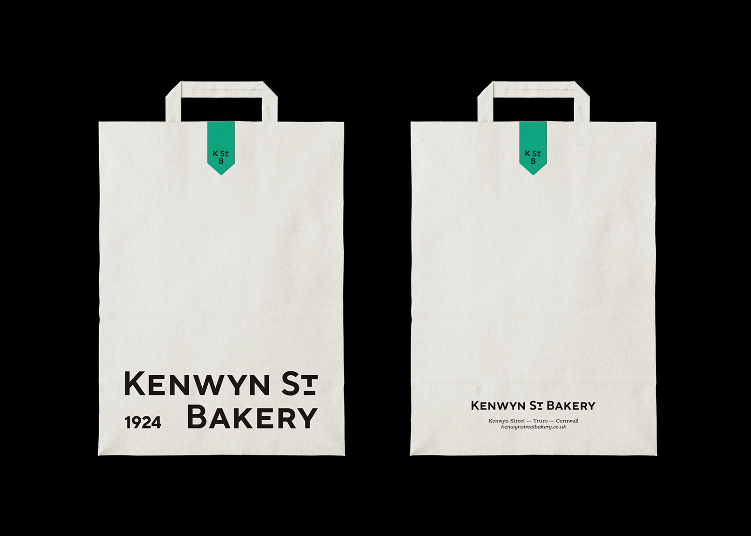
The venue's primary typeface was chosen to evoke the warmth of typography in the 1960s and 70s, opting for a bold and sharp serif. For versatility, additional versions of the logo were created for casual use, drawing inspiration from the dynamic energy of nightlife.
The previous logo incorporated a heart symbol within the 'O' for emphasis, but this element has been dialled back to be exclusively reserved for editorial usage.
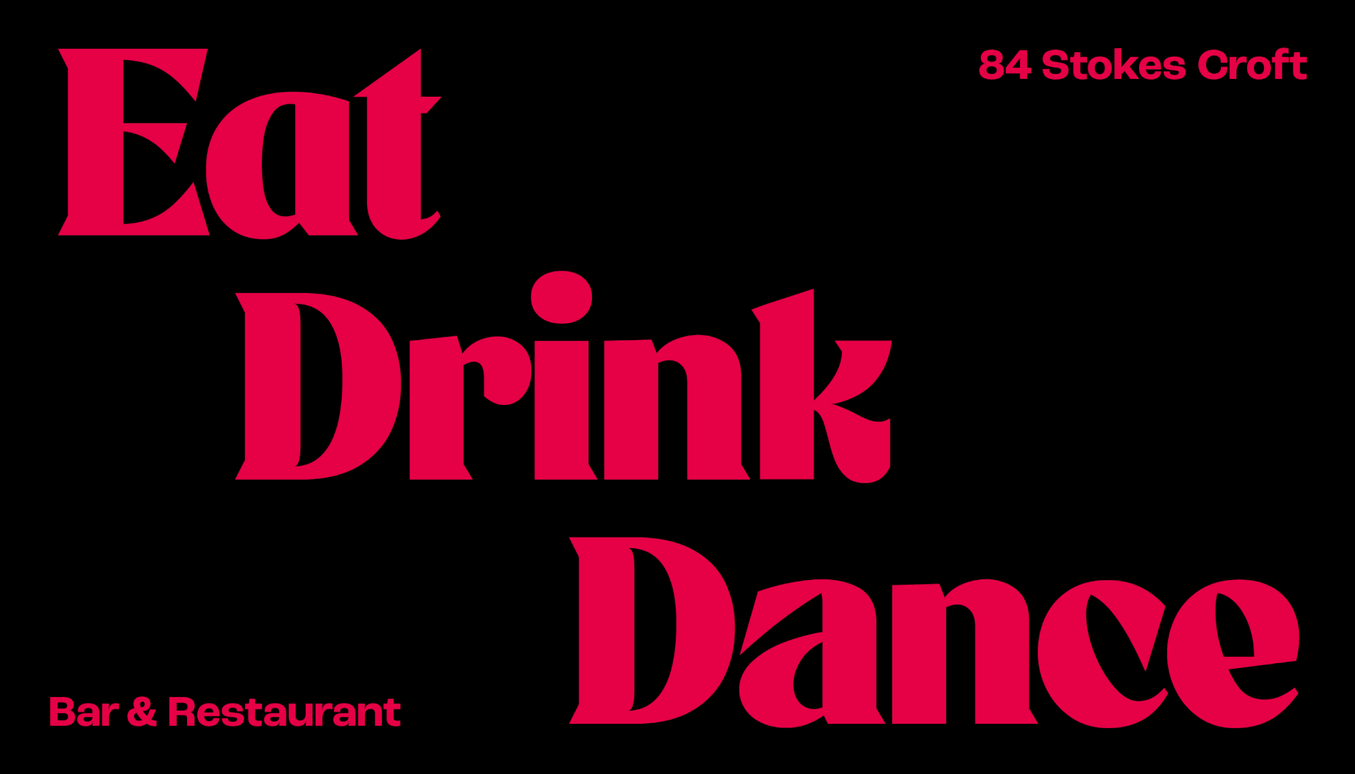
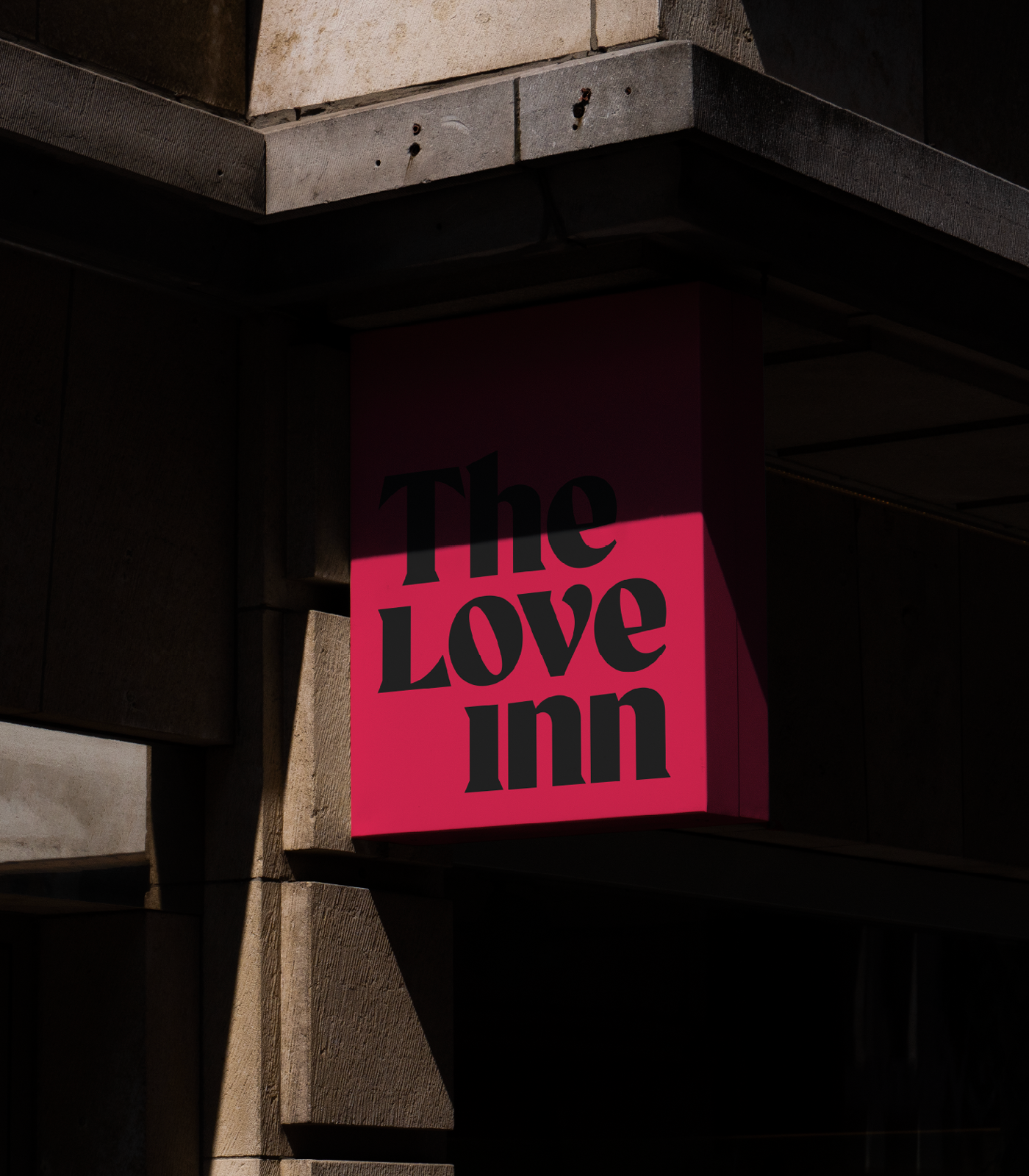
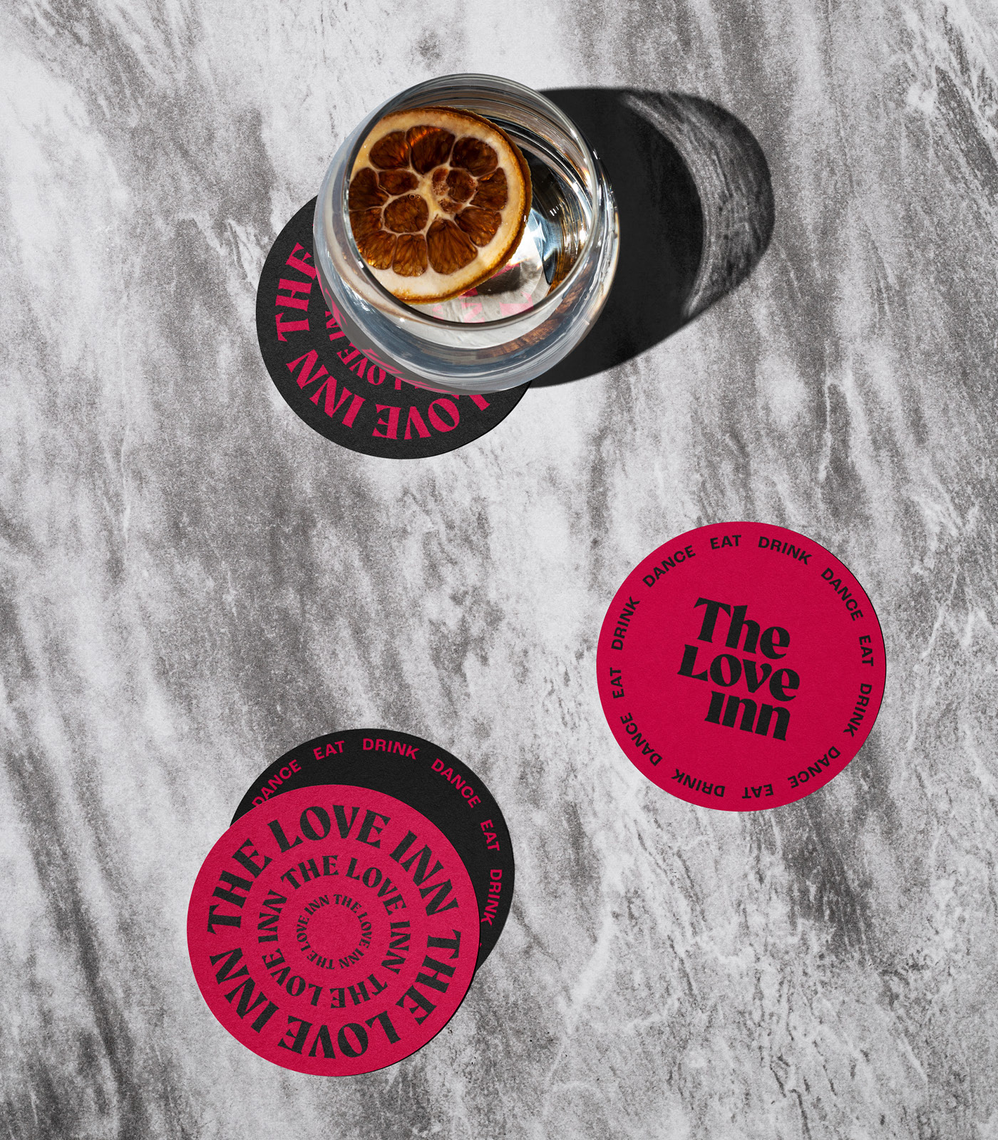
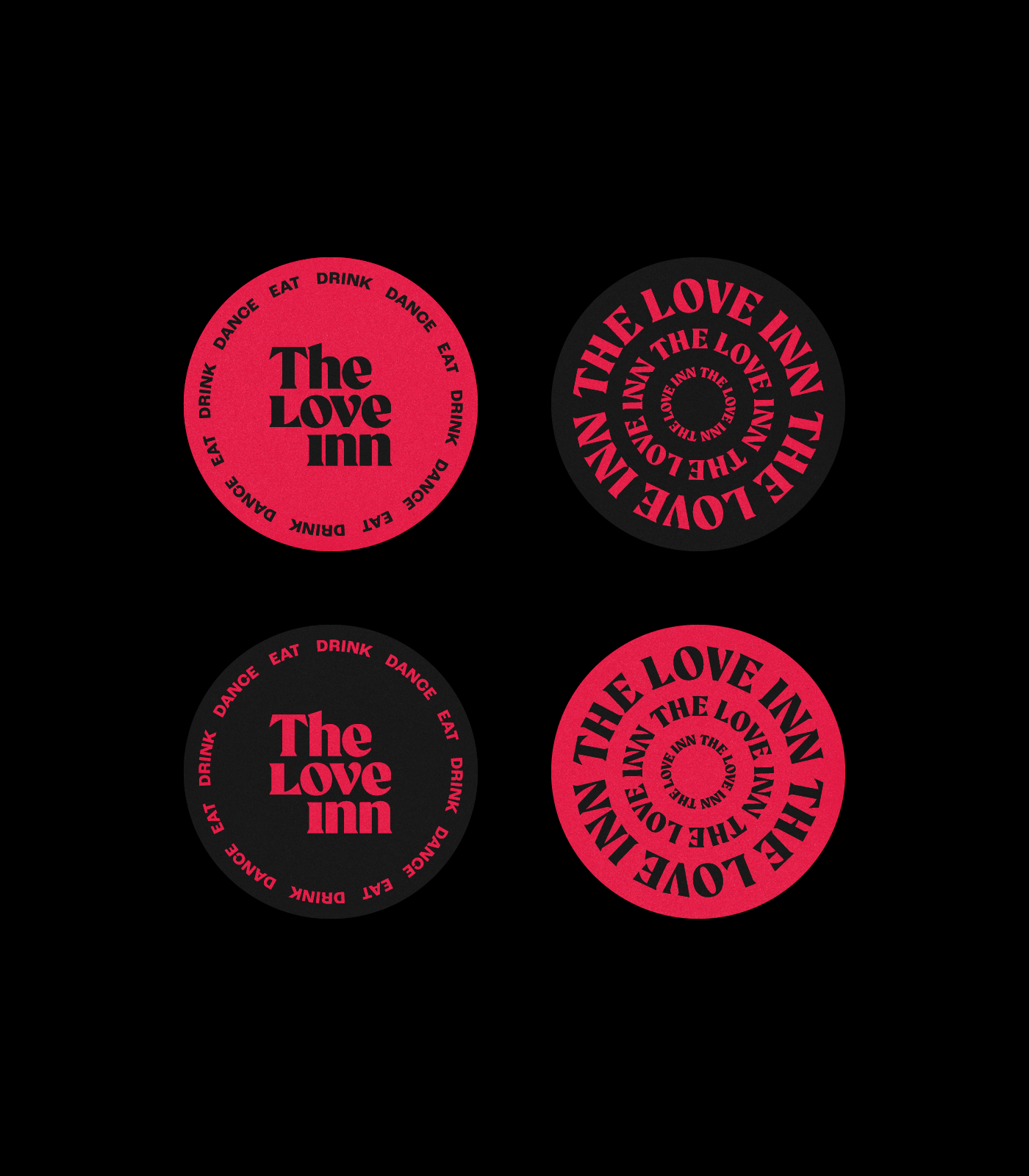
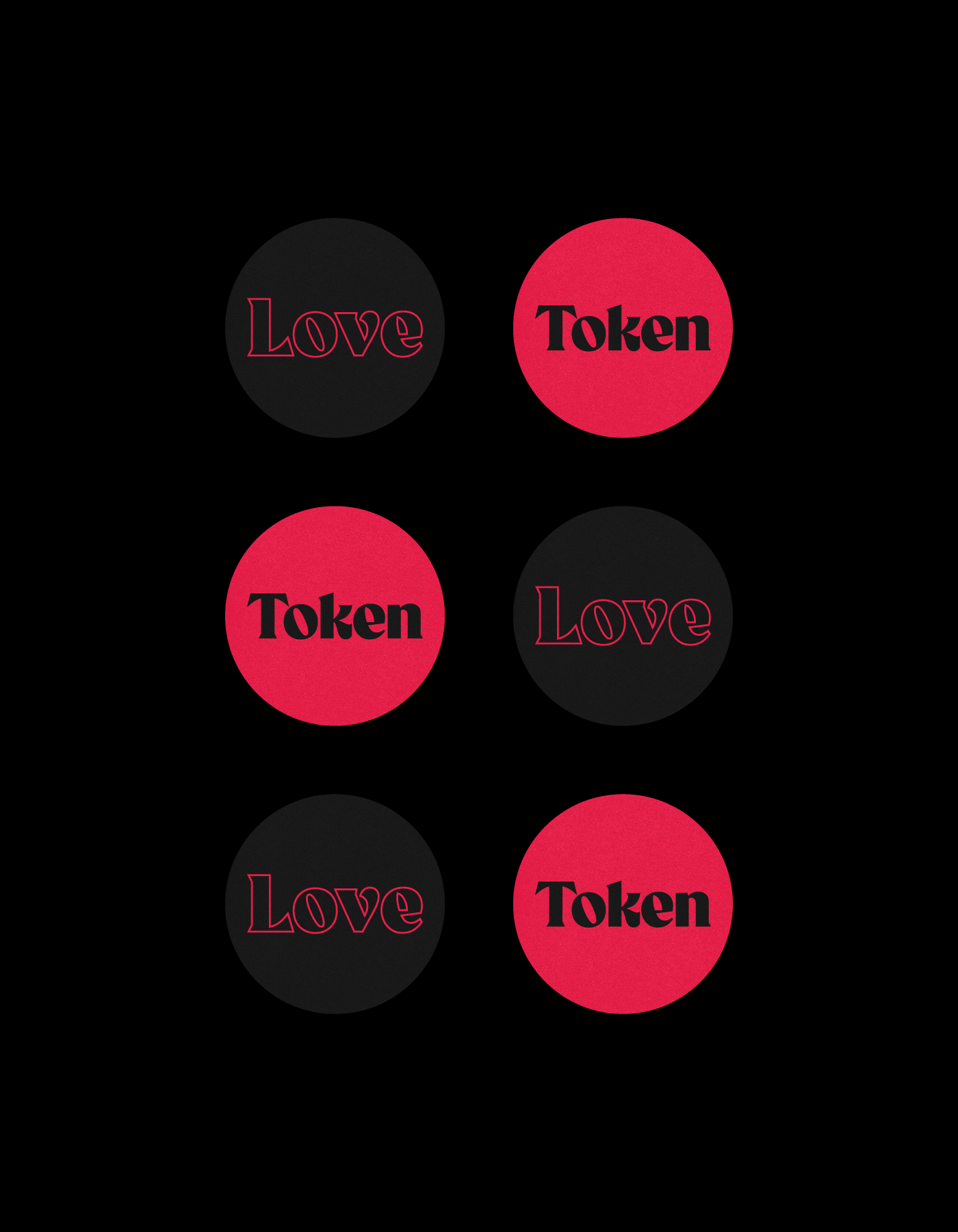
A vibrant palette of red and black has replaced the previous pink and white scheme, injecting a bold new energy while steering clear of conventional colour choices.
The previous logo incorporated a heart symbol within the 'O' for emphasis, but this element has been dialled back to be exclusively reserved for editorial usage.
A vibrant palette of red and black has replaced the previous pink and white scheme, injecting a bold new energy while steering clear of conventional colour choices.