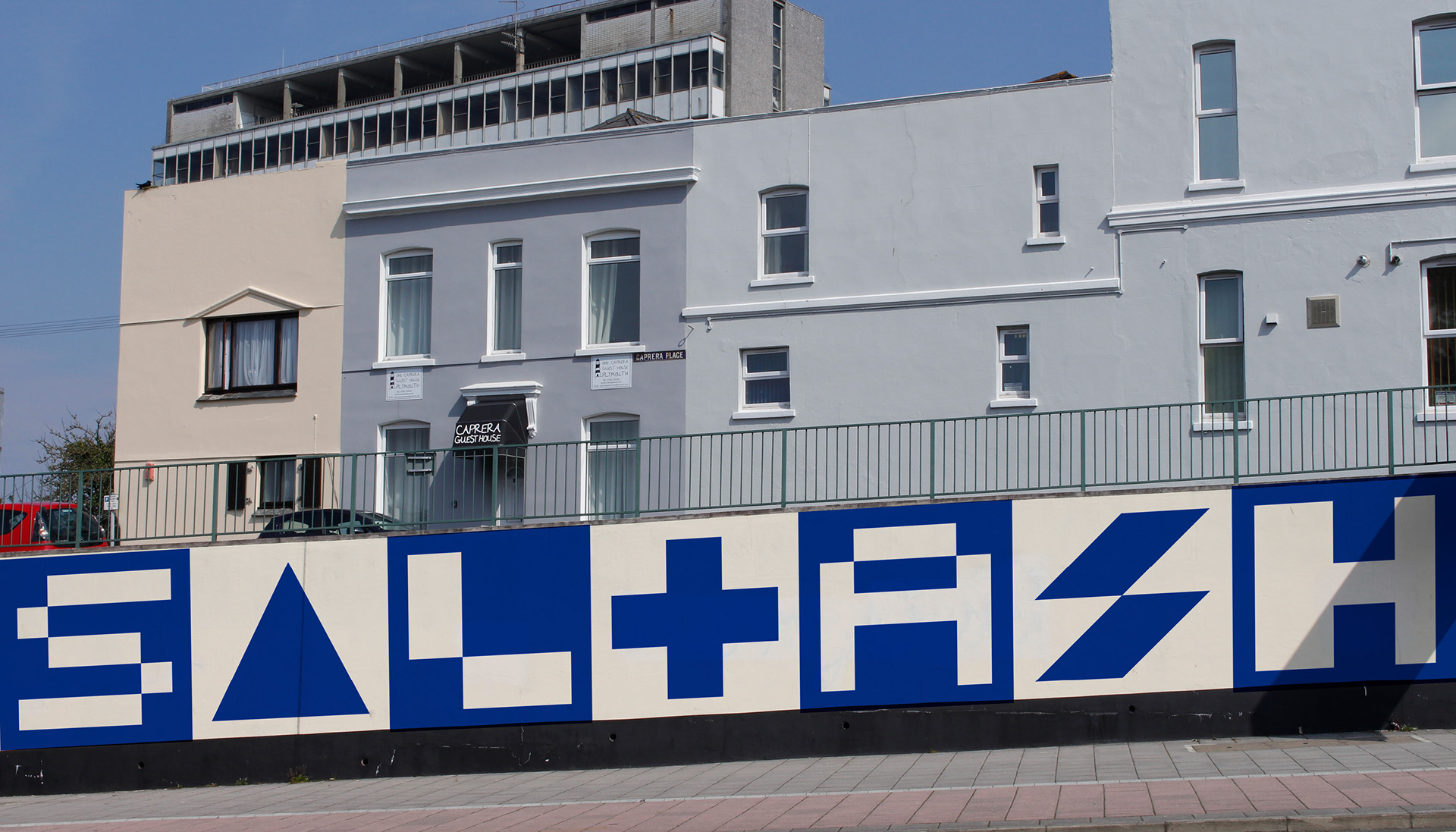
Chromacity
A city identity plan targeted at improving mental health in urban environments using colour. Britain's Ocean City, Plymouth, was chosen for the project's conceptual pilot.
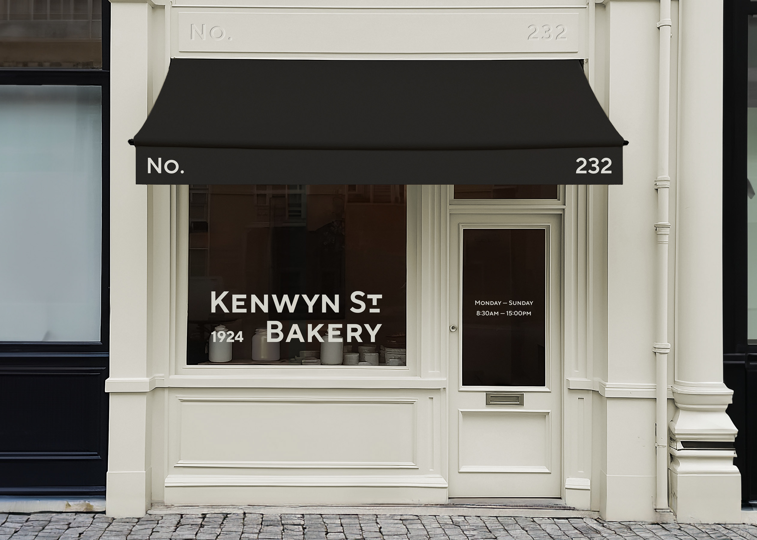
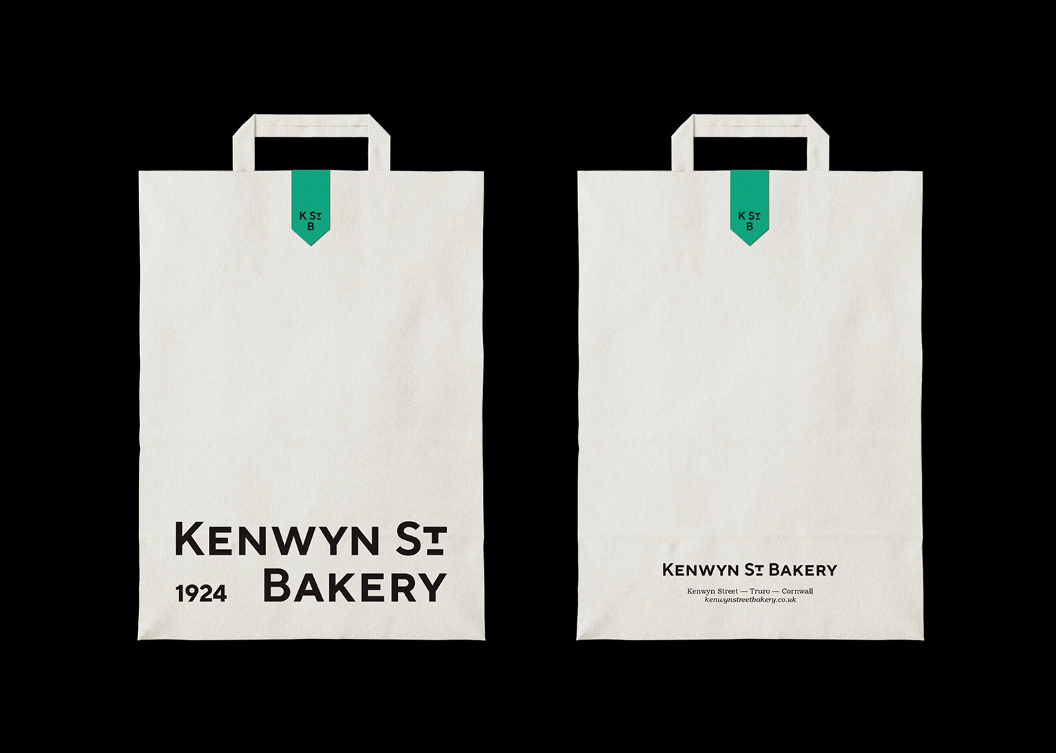
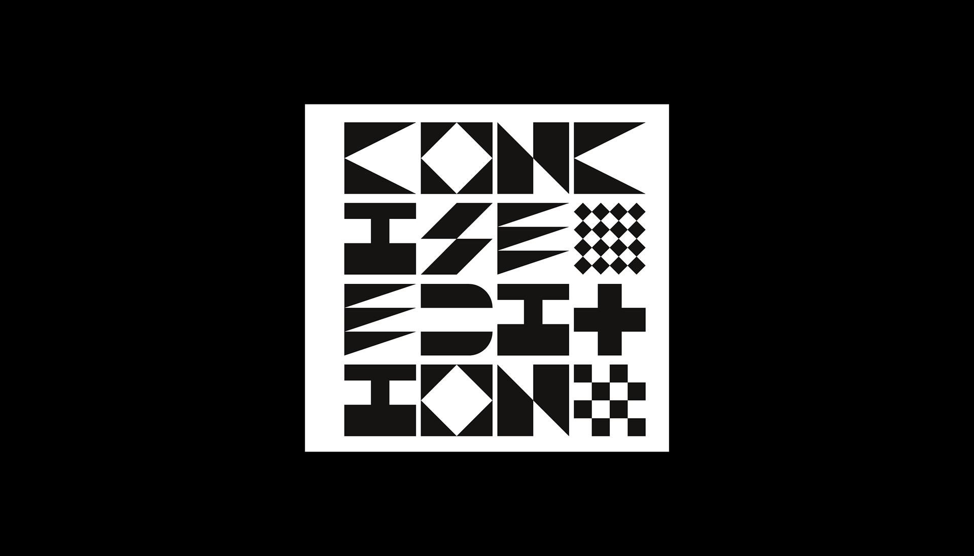
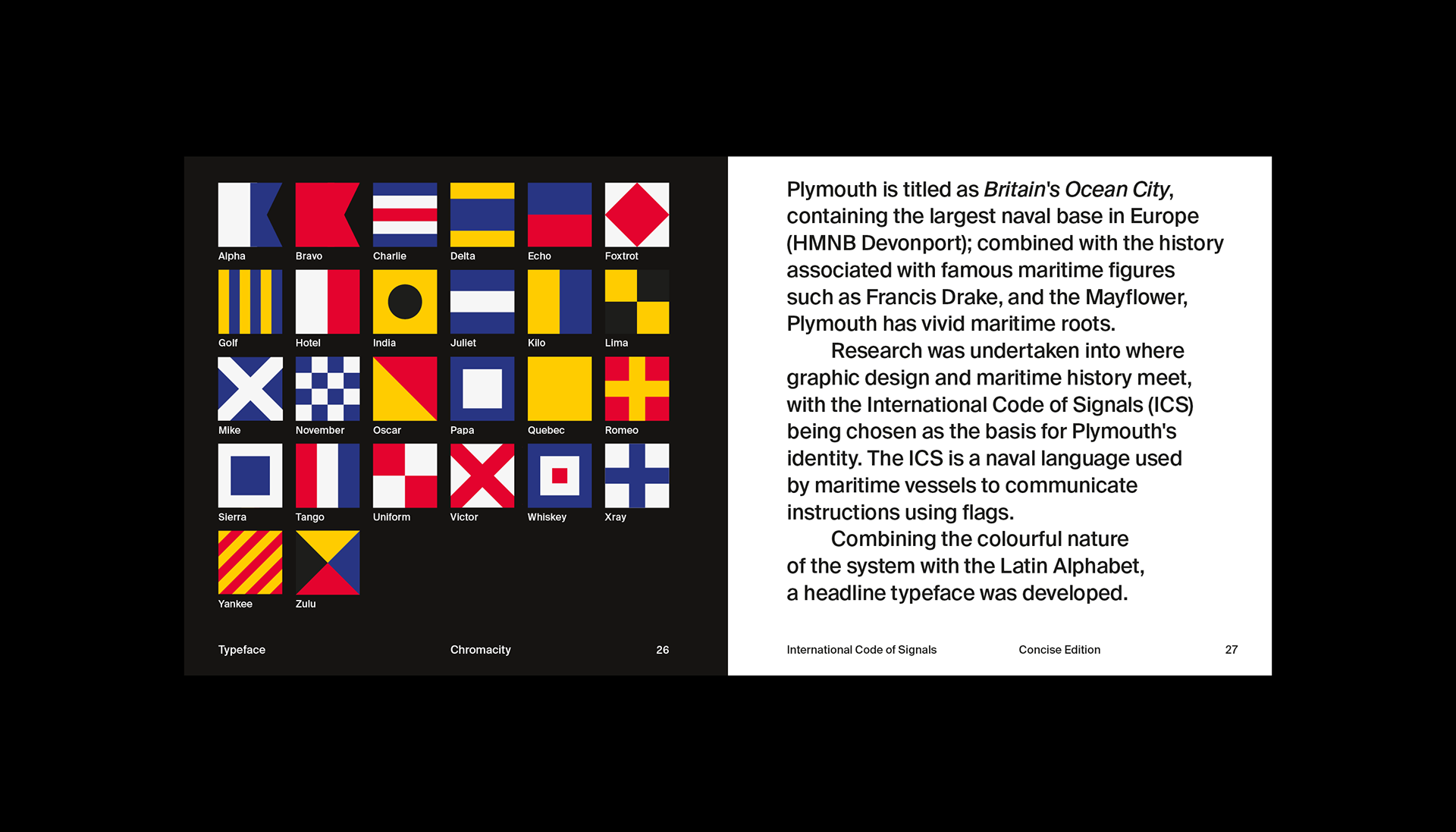
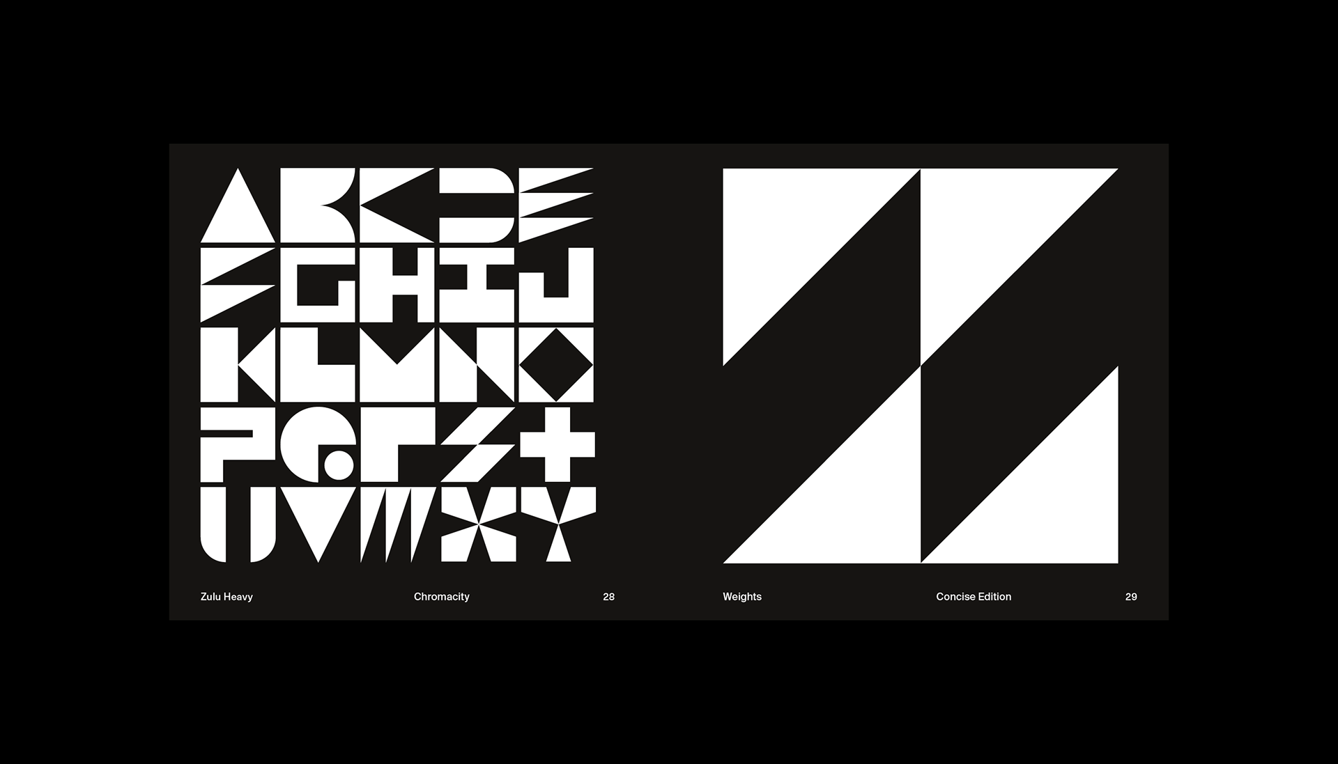
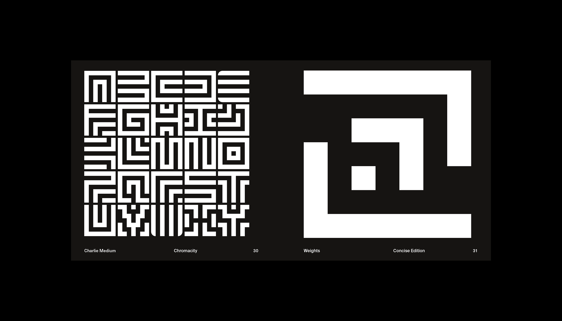
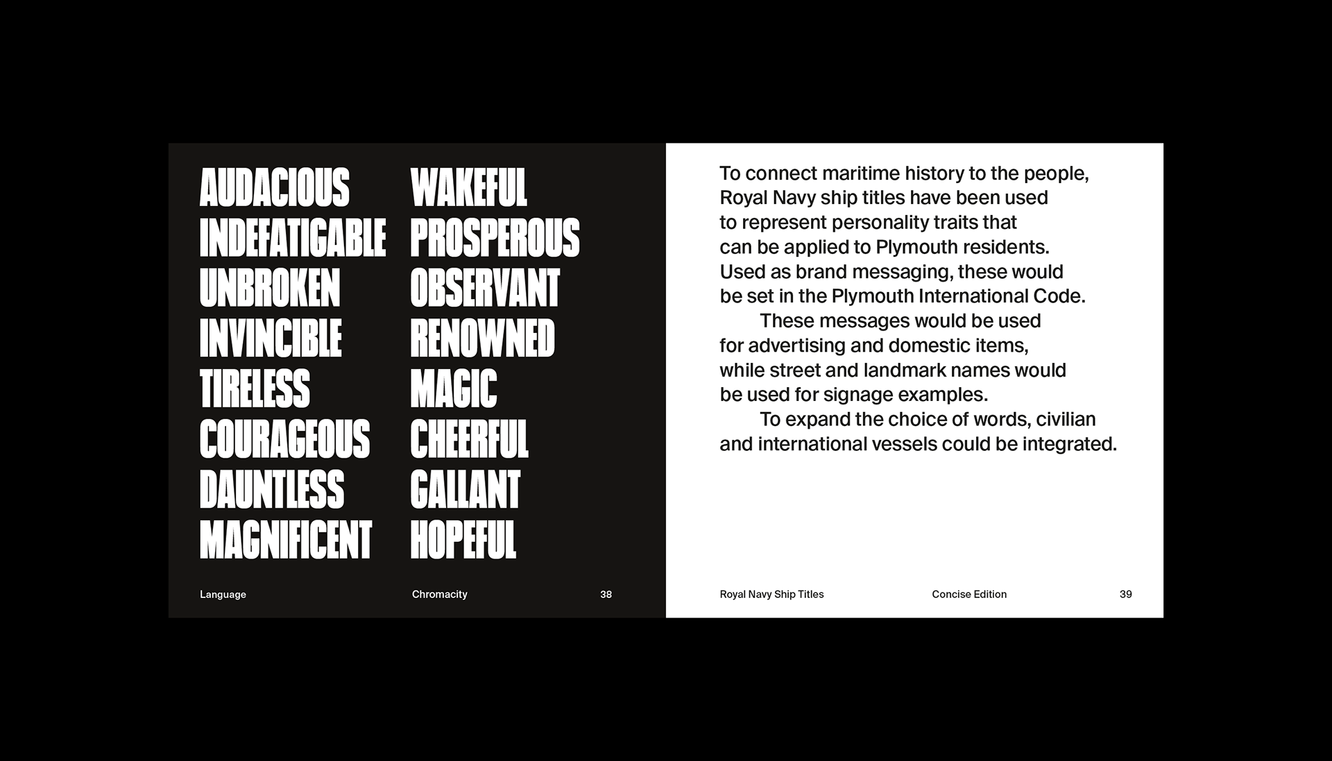
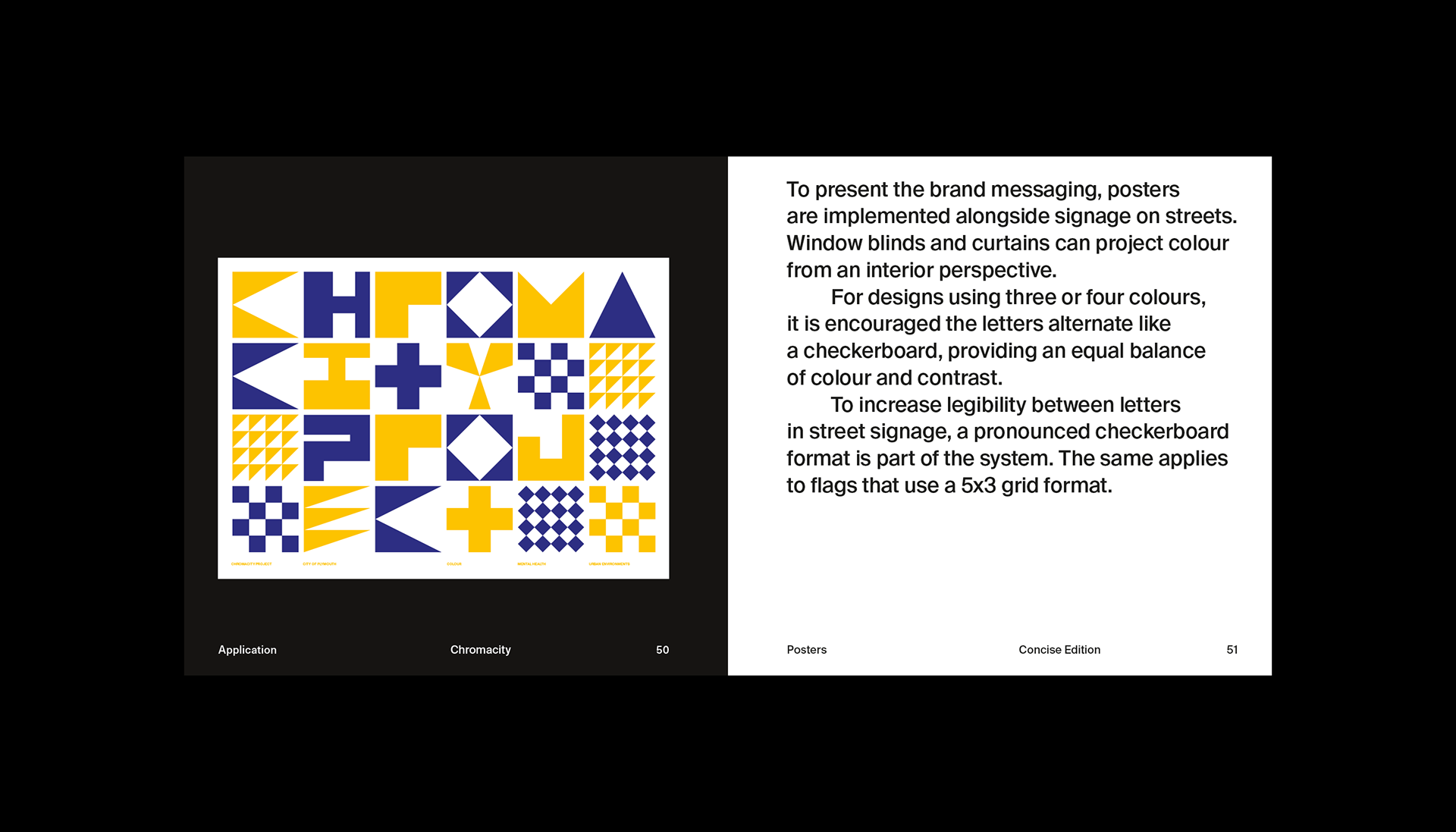
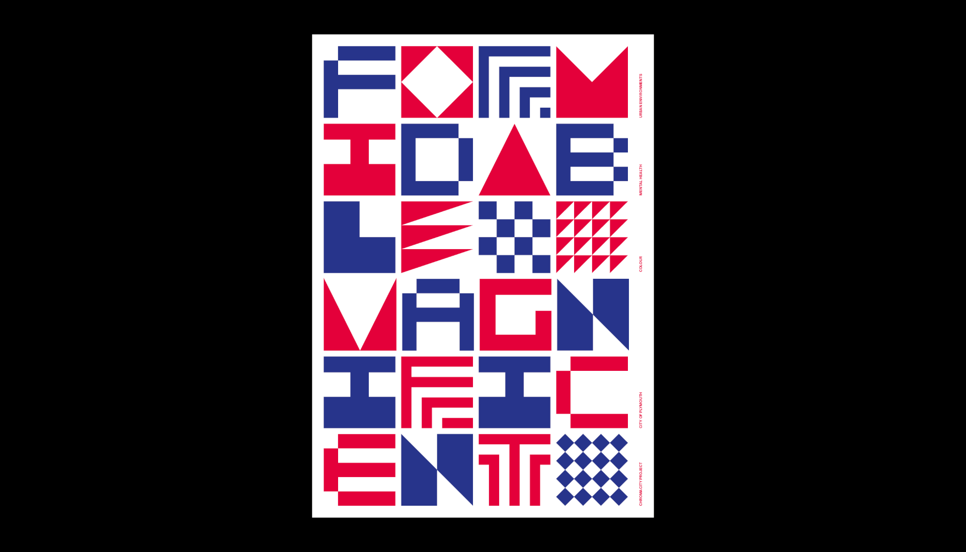
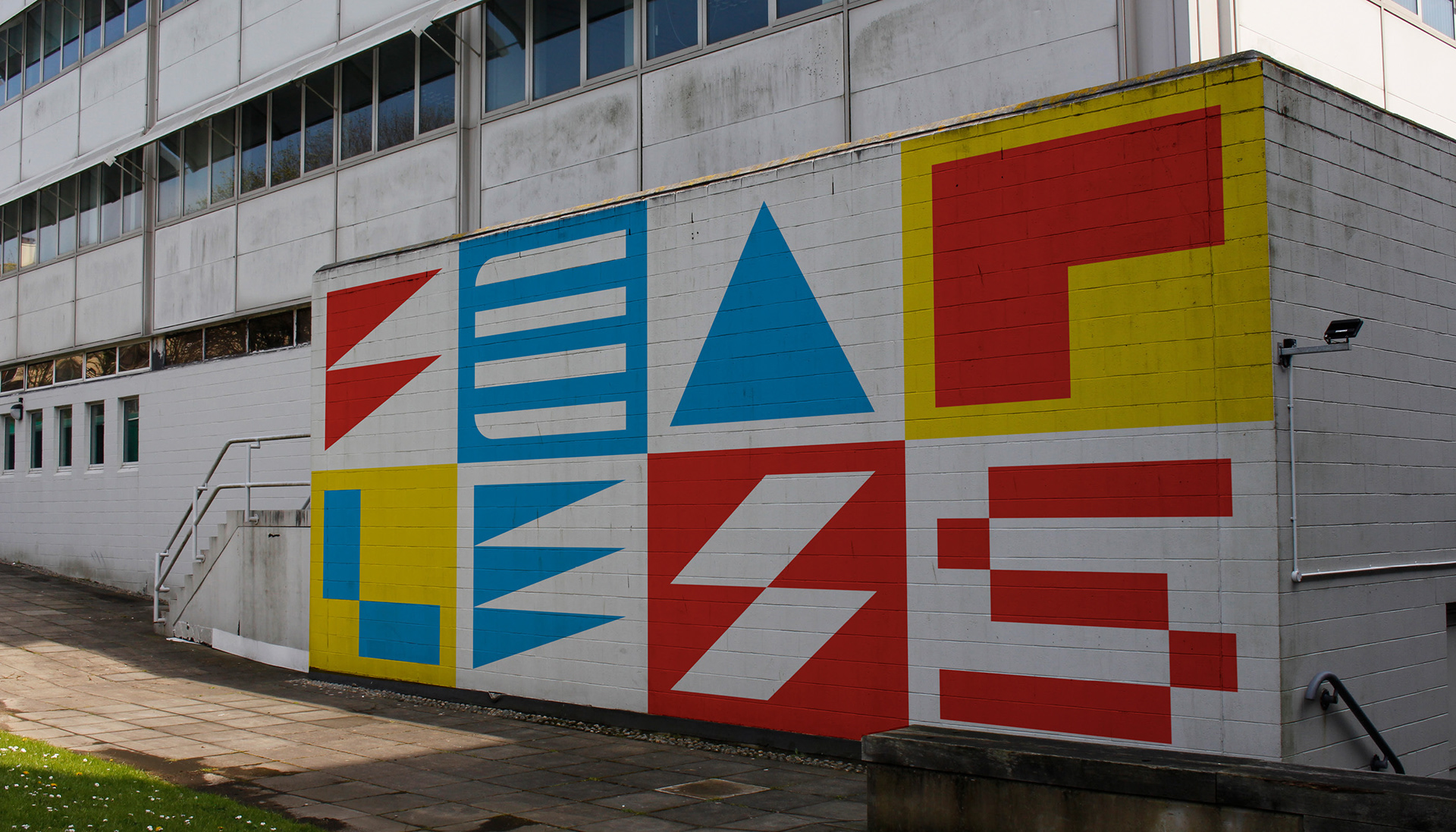
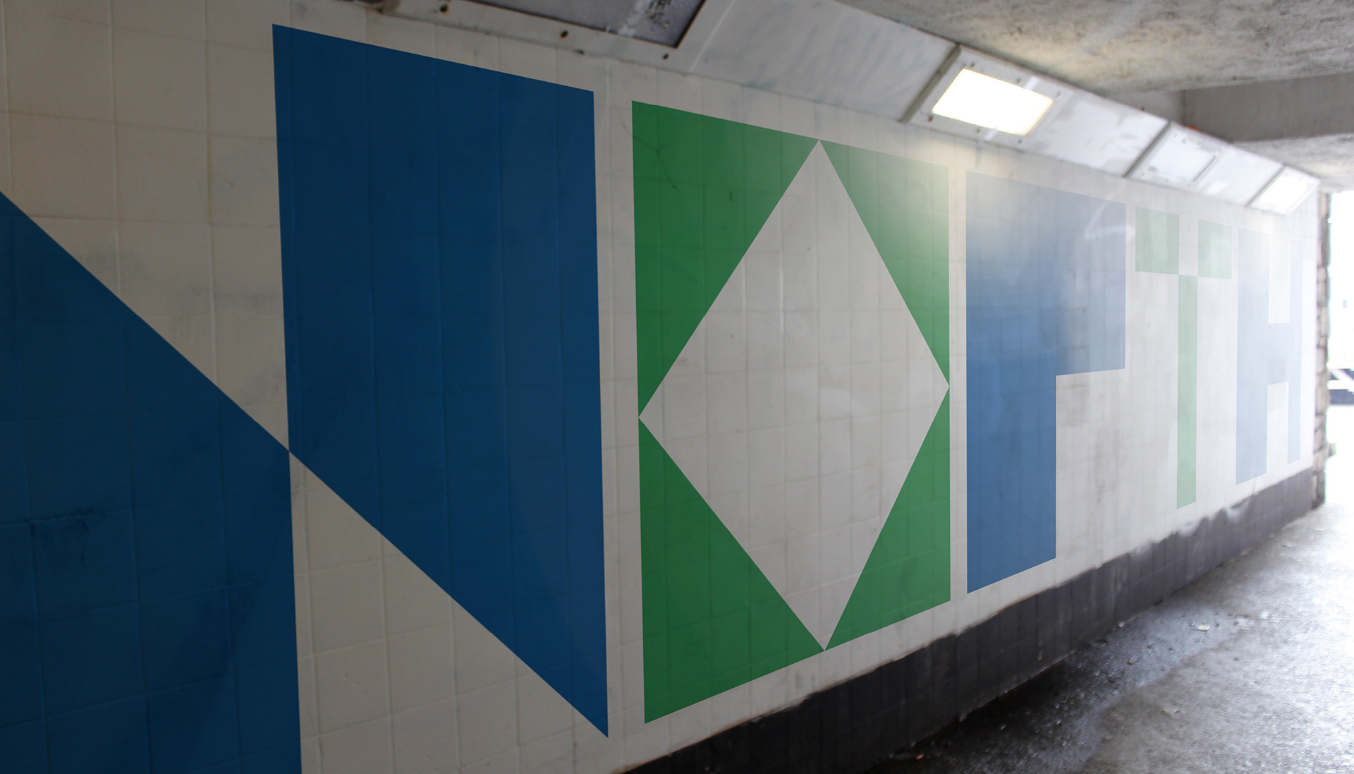
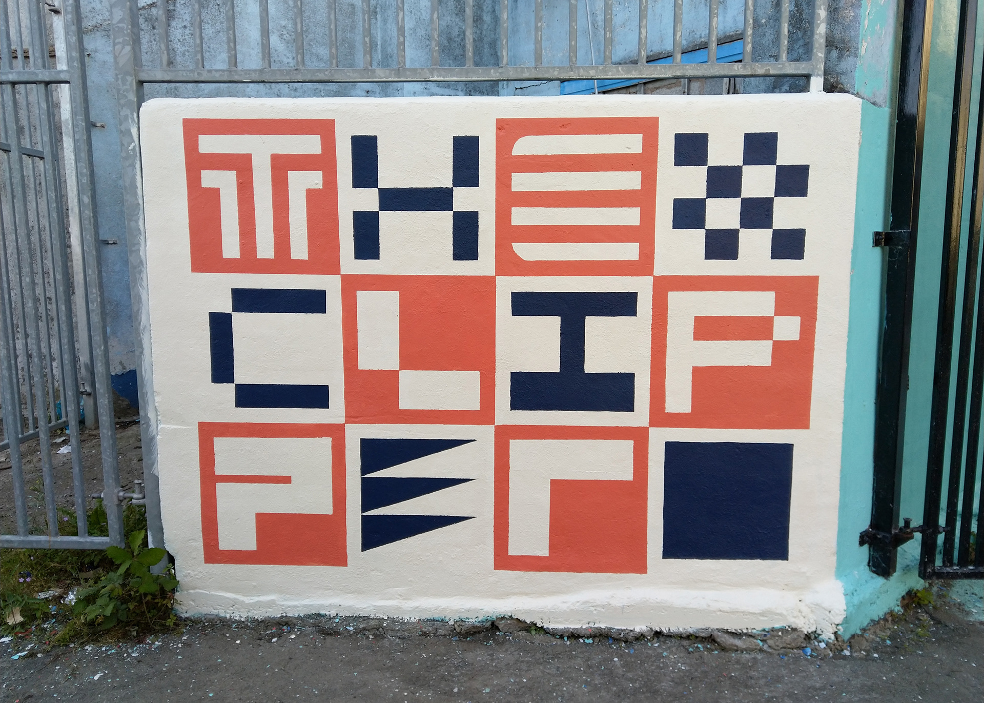
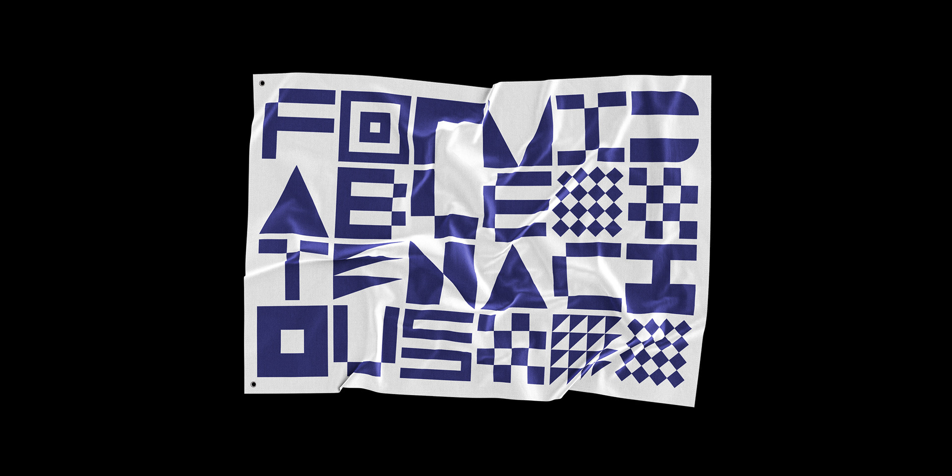
With extensive research, visual documentation and archives; a three-weight typeface was produced. Its primary application would be a semi-abstract signage system to benefit both residents and tourists. The design was chosen to be inspired by the International Code of Signals (ICS), transferring the city's maritime history to its streets. 2020 was the 400th anniversary of the Mayflower voyage.
With extensive research, visual documentation and archives; a three-weight typeface was produced. Its primary application would be a semi-abstract signage system to benefit both residents and tourists. The design was chosen to be inspired by the International Code of Signals (ICS), transferring the city's maritime history to its streets. 2020 was the 400th anniversary of the Mayflower voyage.


Credits + Thanks
Alan O'Reardon (Plymouth City Museum)
Alan Qualtrough (Typography)
Betsy Humberstone (Mural)
Connor Pocock (Photography)
Gary Hicks (Maritime Research)
Hope Parnell (Mural and Logistics)
Jodie Bishop (Plymouth City Council)
National Maritime Museum Cornwall
Nudge Community Builders
Plymouth College of Art
South West Coastal Path
Alan Qualtrough (Typography)
Betsy Humberstone (Mural)
Connor Pocock (Photography)
Gary Hicks (Maritime Research)
Hope Parnell (Mural and Logistics)
Jodie Bishop (Plymouth City Council)
National Maritime Museum Cornwall
Nudge Community Builders
Plymouth College of Art
South West Coastal Path