Kenwyn Street Bakery
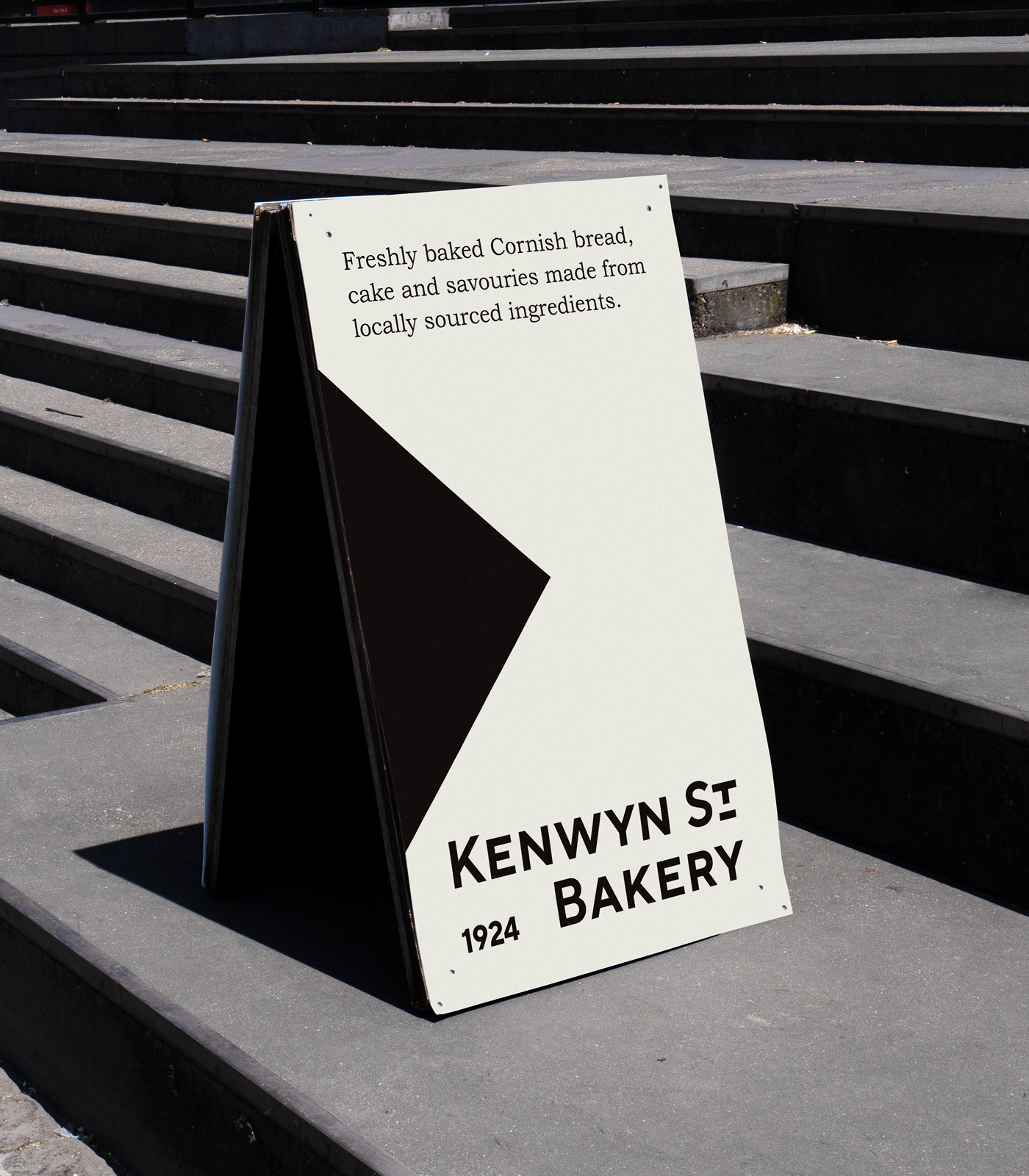
Identity design concept for an artisanal family bakery based in Truro, Cornwall.
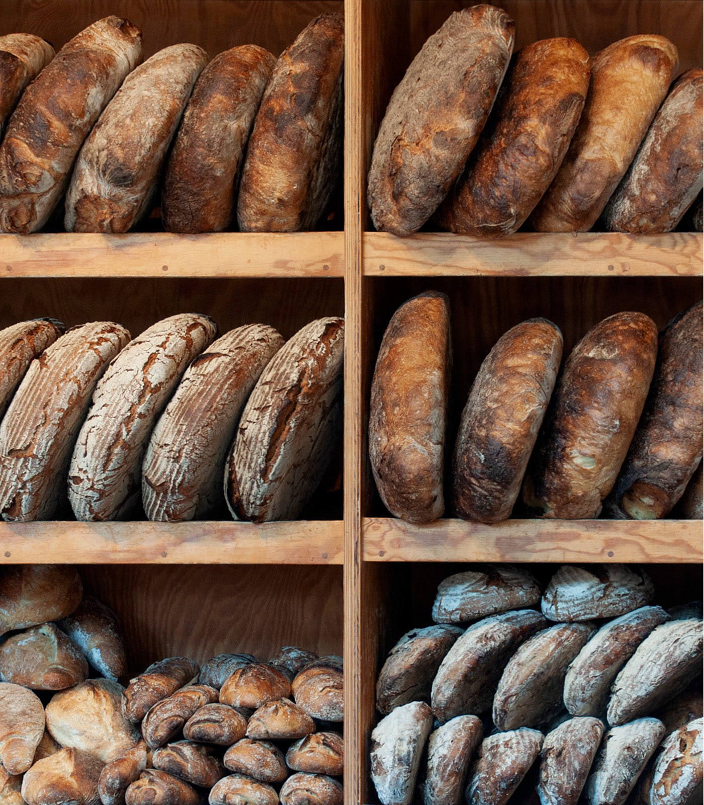
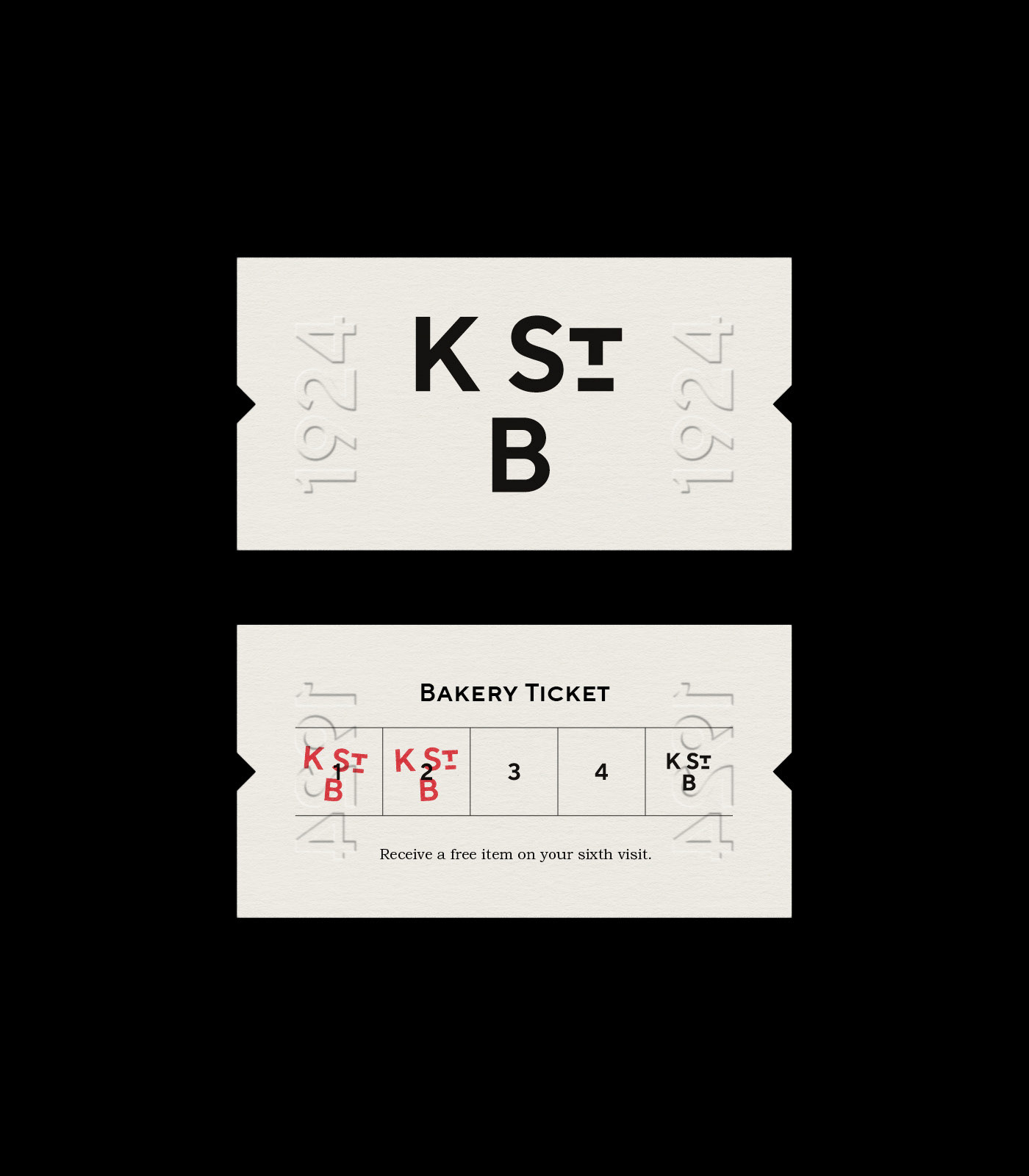
1924 is an important date in the bakery’s history, with the bread-making process of that time serving as the foundation for its design story and ethos. In the early 1900s, bread would have been delivered regularly by hand, developing the relationship between bakers and their customers. Kenwyn Street Bakery aims to rekindle this connection, introducing a modern take on historic Cornish recipes using locally sourced ingredients, creating an authentic experience for locals and tourists, while standing out from other bakeries.
1924 is an important date in the bakery’s history, with the bread-making process of that time serving as the foundation for its design story and ethos. In the early 1900s, bread would have been delivered regularly by hand, developing the relationship between bakers and their customers. Kenwyn Street Bakery aims to rekindle this connection, introducing a modern take on historic Cornish recipes using locally sourced ingredients, creating an authentic experience for locals and tourists, while standing out from other bakeries.
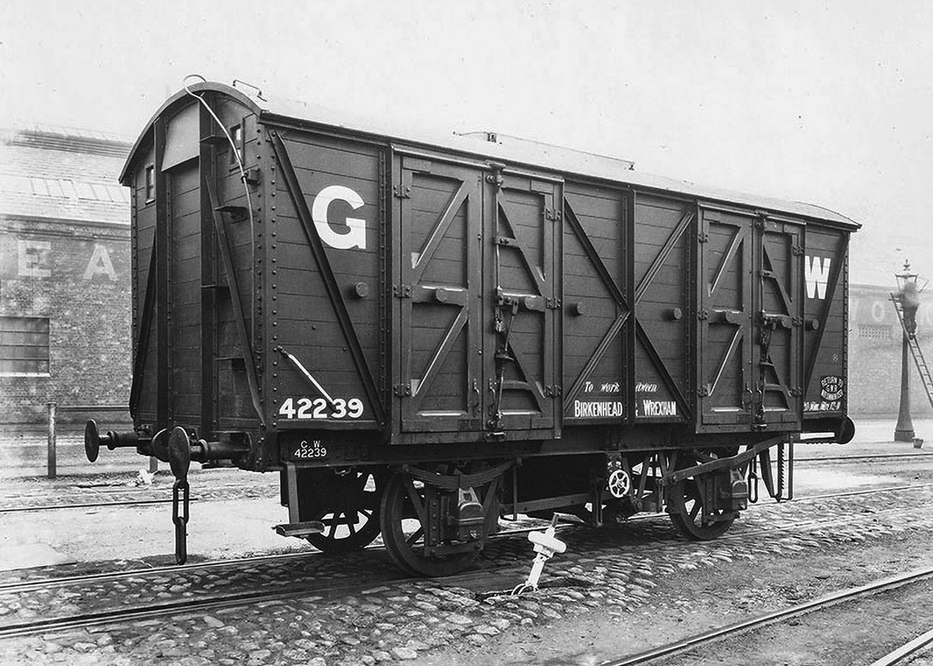
GWR Grain Wagon (No. 42239)
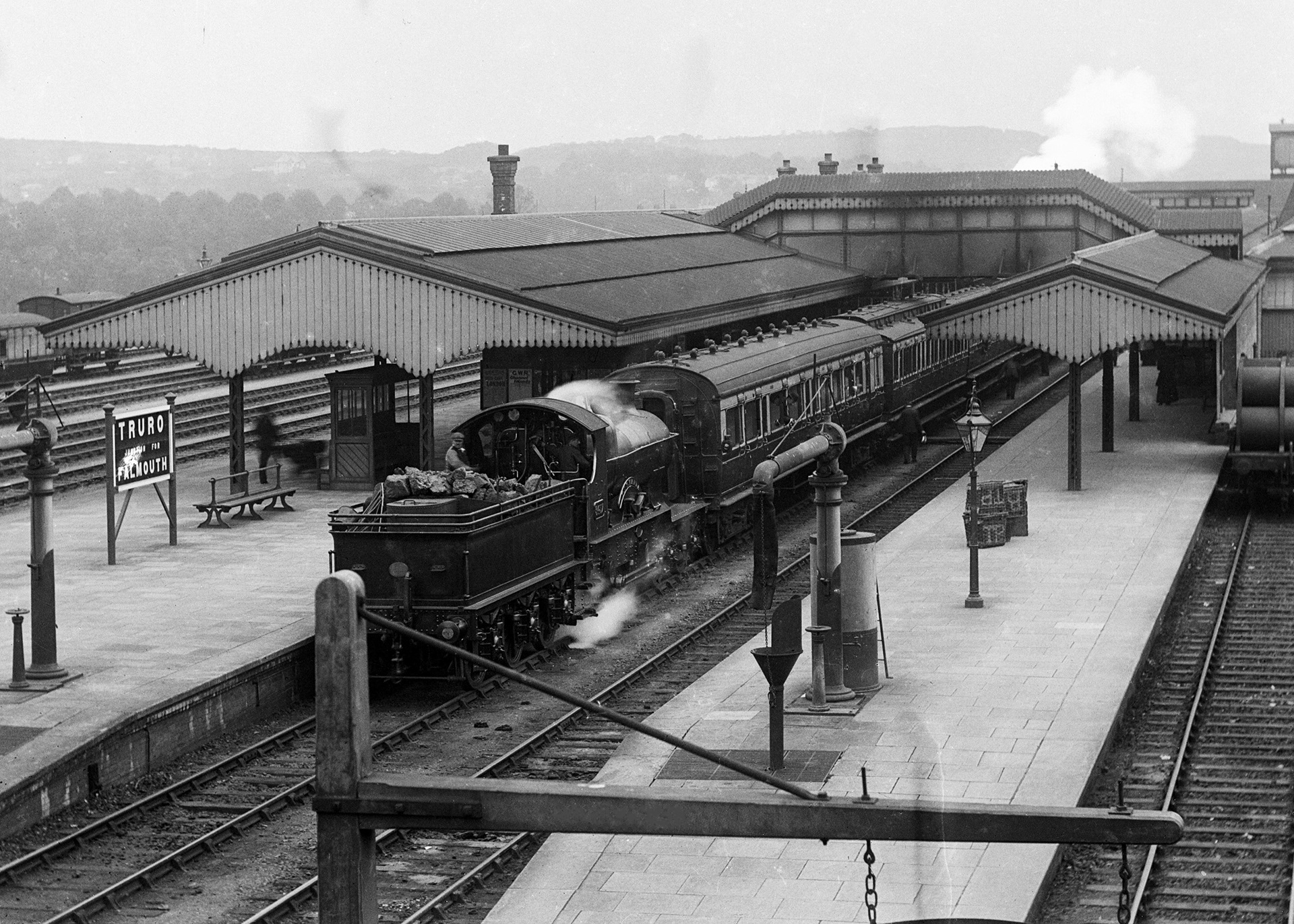
Truro Station (1904–1912)
.
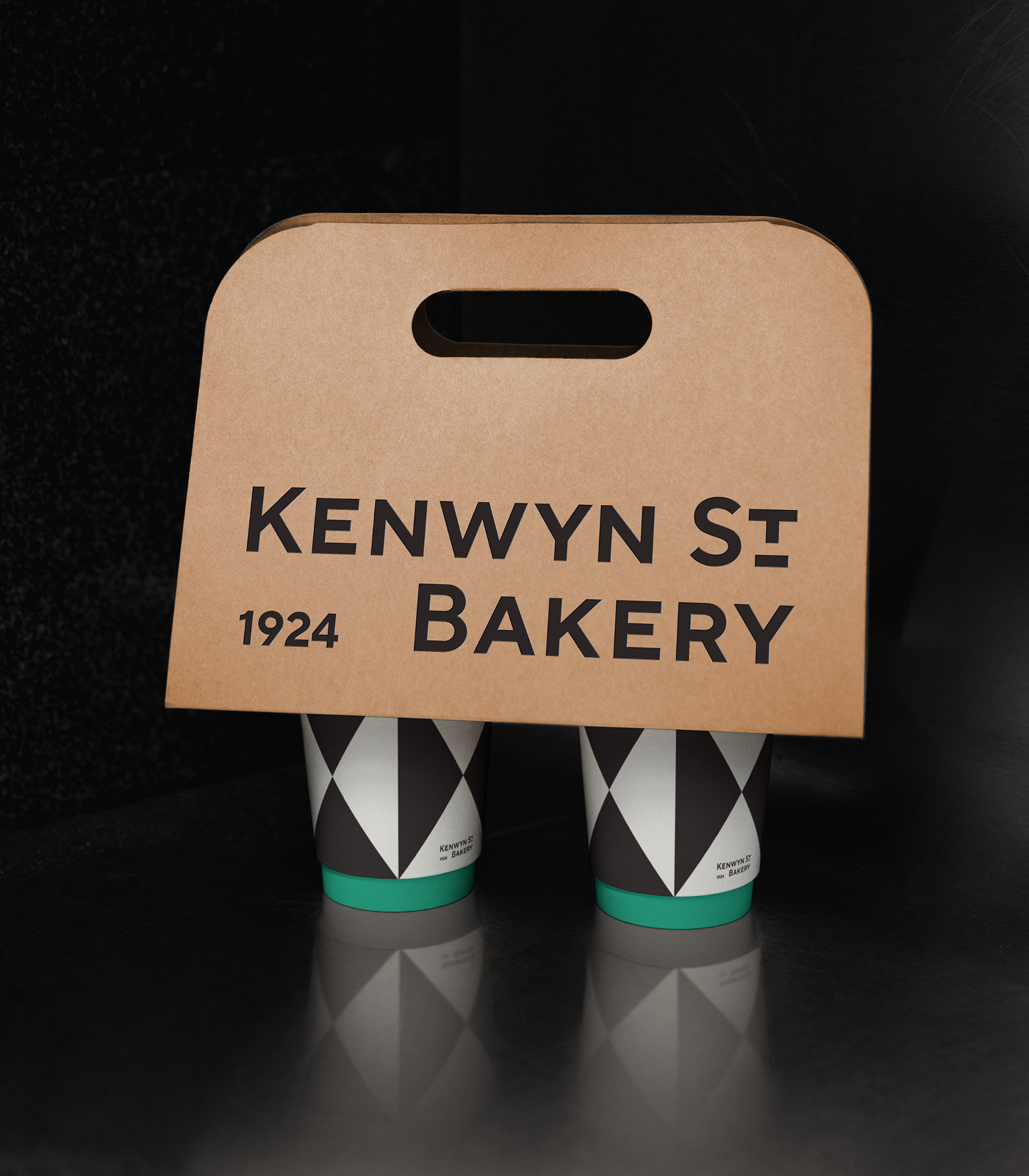
For the original bakery, the Great Western Railway (based in the South West of England), would have played a vital role in transporting grain and flour. Typography and ephemera of Cornish bakeries and the GWR of the period were used as a reference for the logotype design and typeface choices, providing a faithful link to the bakery’s history, while reworking the visual style of the era into a modern context.
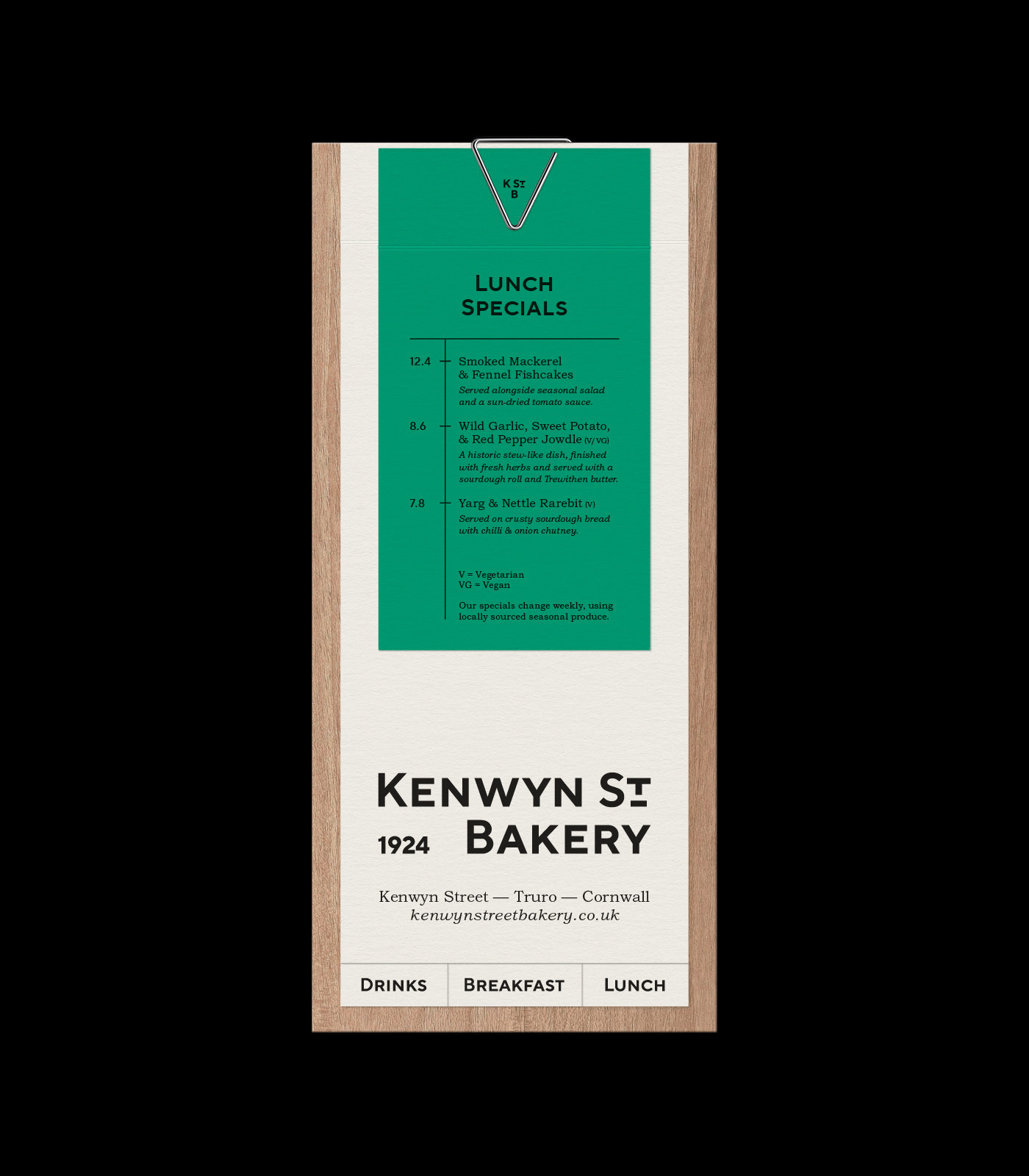
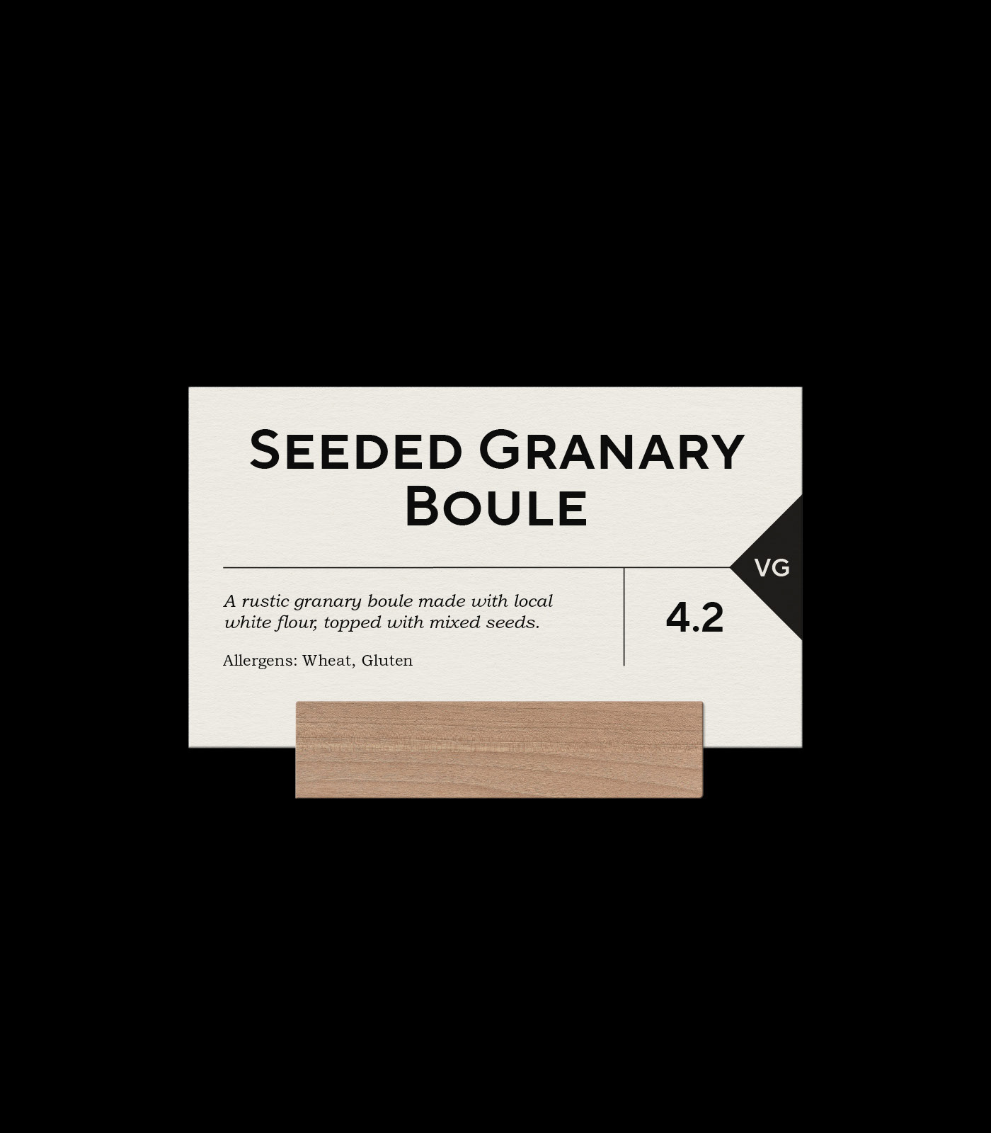
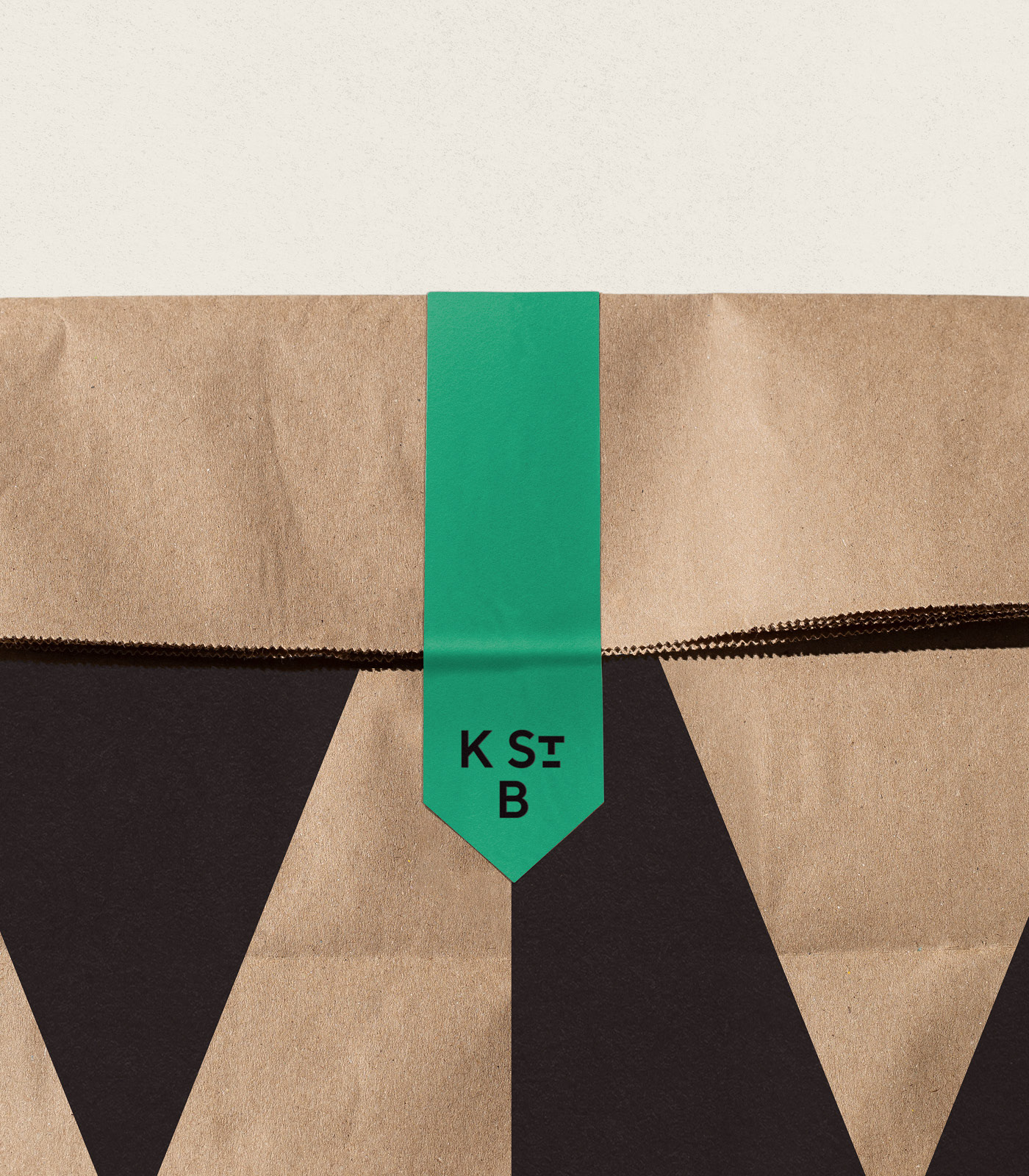
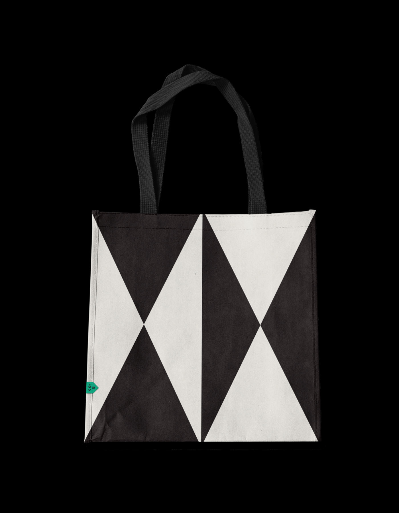
The triangular shapes seen on the doors of grain wagons were a starting point for the bakery’s visual language, with the iconic daggerboards seen hanging from station roofs inspiring the crest-like motif used throughout the identity.
The colour palette draws on a fresh interpretation of the green used in locomotive liveries, combined with the contemporary black and white of the Cornish flag. A warm, muted brown softens the palette, inspired by rustic interiors and ephemeral bakery packaging.
Credits
Charlotte Cross (co-designer)
Didcot Railway Centre (Grain Wagon Photo)
Royal Cornwall Museum (Truro Photos)
Didcot Railway Centre (Grain Wagon Photo)
Royal Cornwall Museum (Truro Photos)
Stock
Geraud Pfeiffer
Marta Dzedyshko
Wal (Pixabay)
Marta Dzedyshko
Wal (Pixabay)
