Clean Sailors
Identity and guideline design for Clean Sailors, a not-for-profit sailing organisation looking to promote a greener presence to life on the ocean.
Logotype + Mark
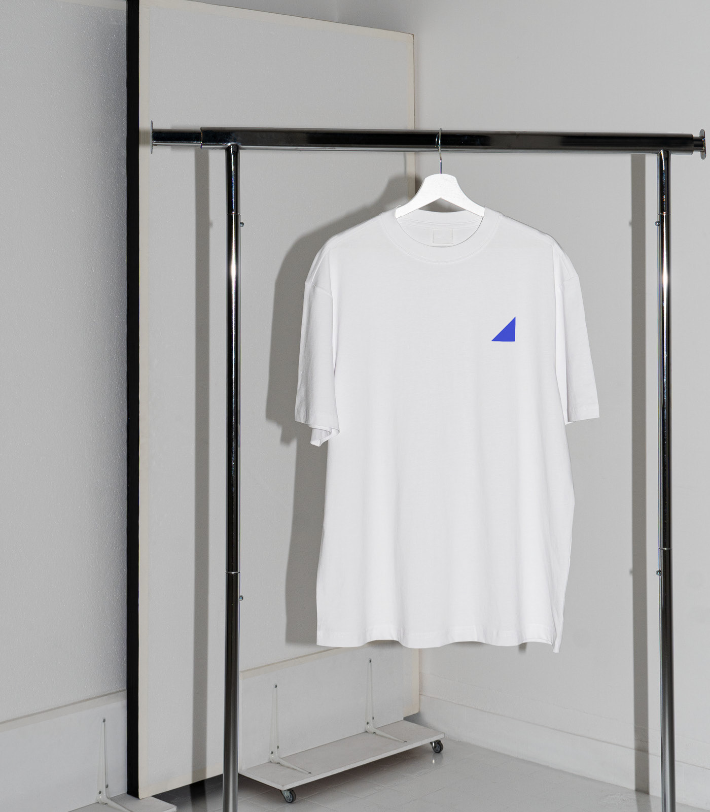
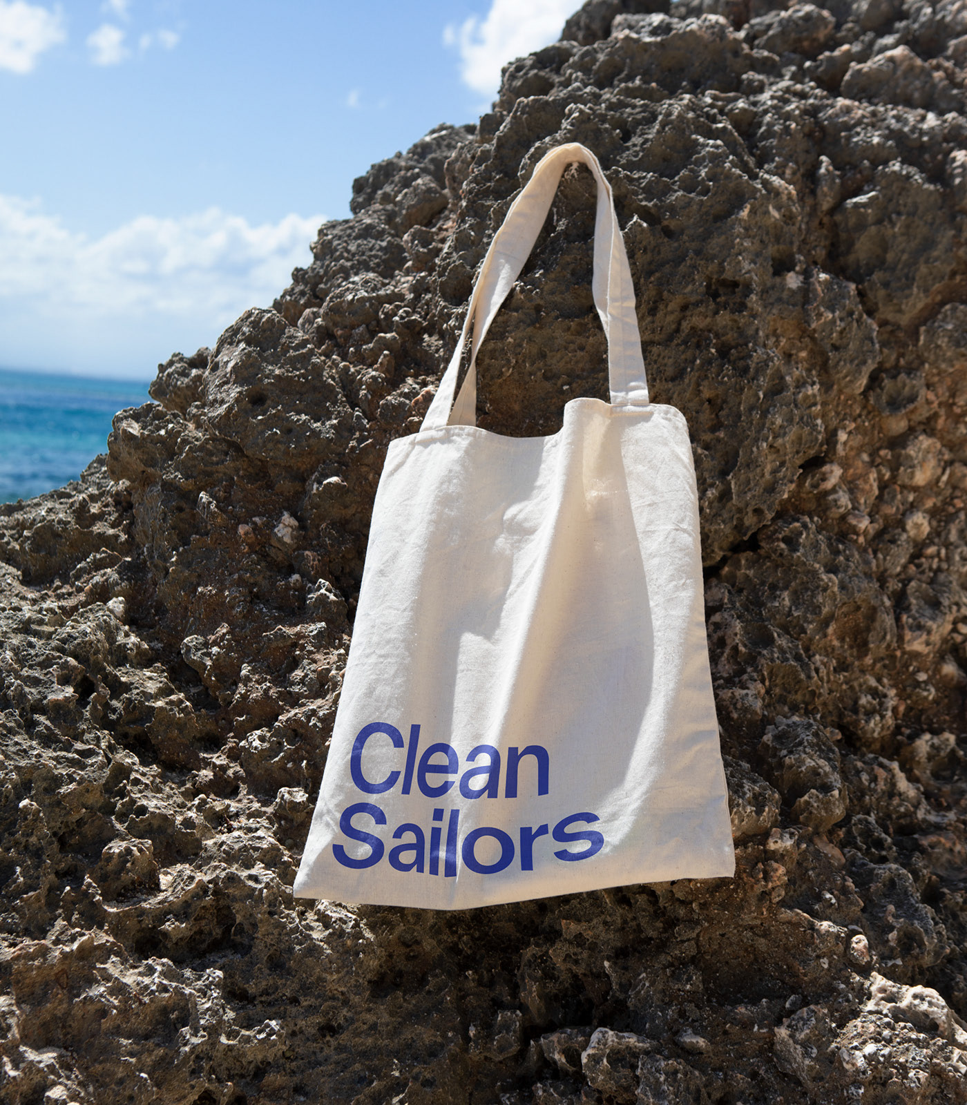
Promotional Merch
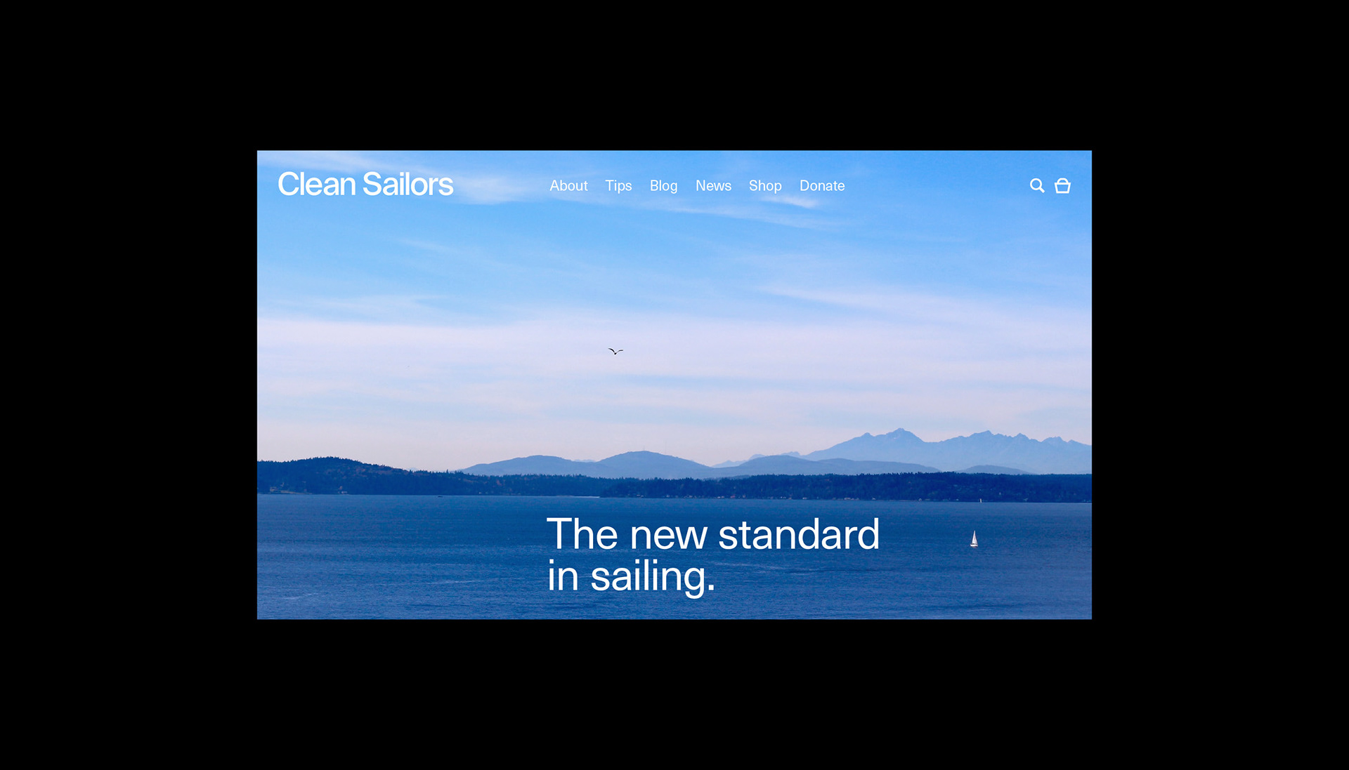
Website Prototype
Identity Guidelines
Social Assets
Promotional Merch
Website Prototype
Identity Guidelines
Social Assets
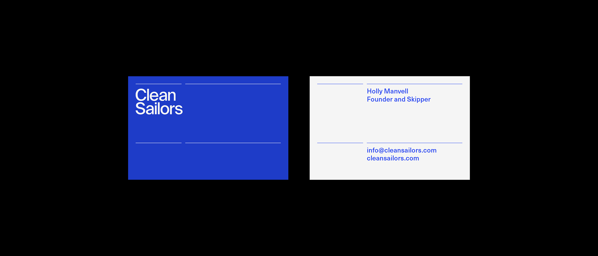
A simple, right-facing triangle – acting as a graphic representation of a sail – was chosen for the logomark, and incorporated into the logotype's ink traps. A variation of International Klein Blue was selected as a primary colour, and Neue Haas Unica for the typeface, inspired by Kieler Woche posters of the mid-century.